Ah - front end development. The world I started my career in and then….ran quickly away from 😄. It was only mere months before I traded out JQuery 4.X for Objective-C and UIKit during my first job, and I never looked back. I didn’t want to.
And yet.
Front end work and know-how within the discipline remains as important as ever, I just can’t seem to hide from it. I did try to for this very blog, but a true C.M.S. quickly became restrictive. I realized the best way to overhaul my piece of the internet was to simply do what I usually do:
Take the absolute longest route and do it all myself.
Well, mostly myself. The result of the site you see today has many thanks to do with the popular CSS framework, Tailwind CSS. So, how did an iOS dev who still has to Google correct CSS syntax to center text get on with it? Let’s find out.
The Result
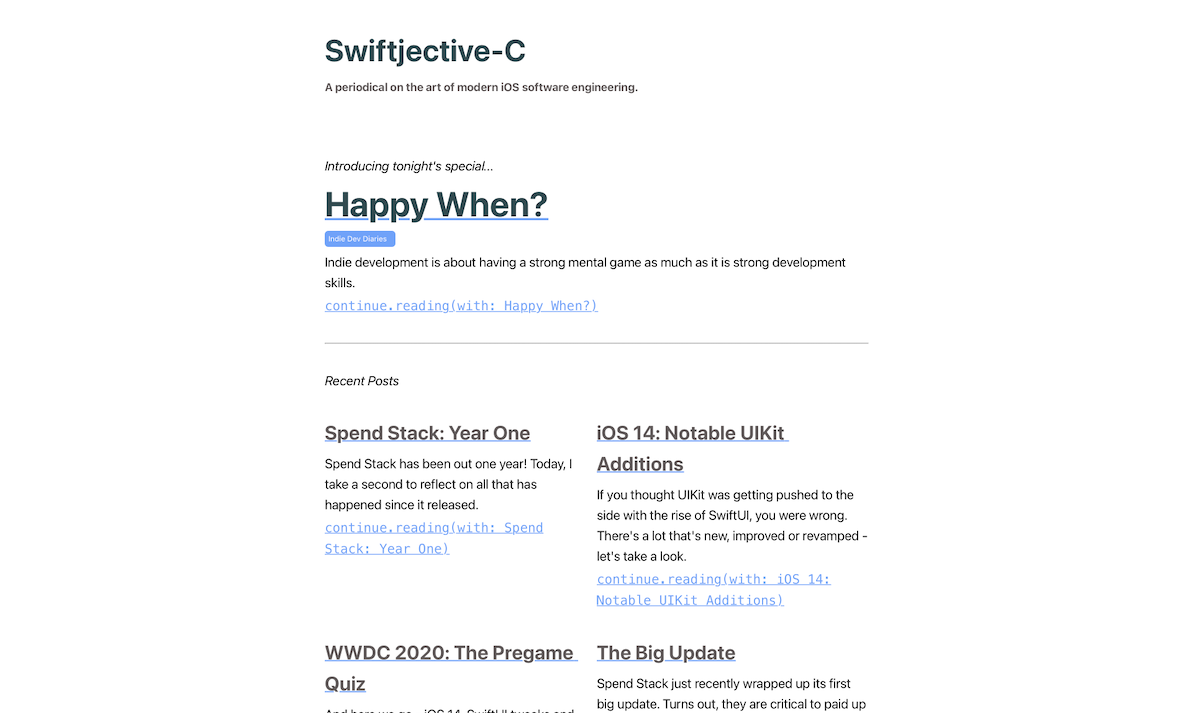
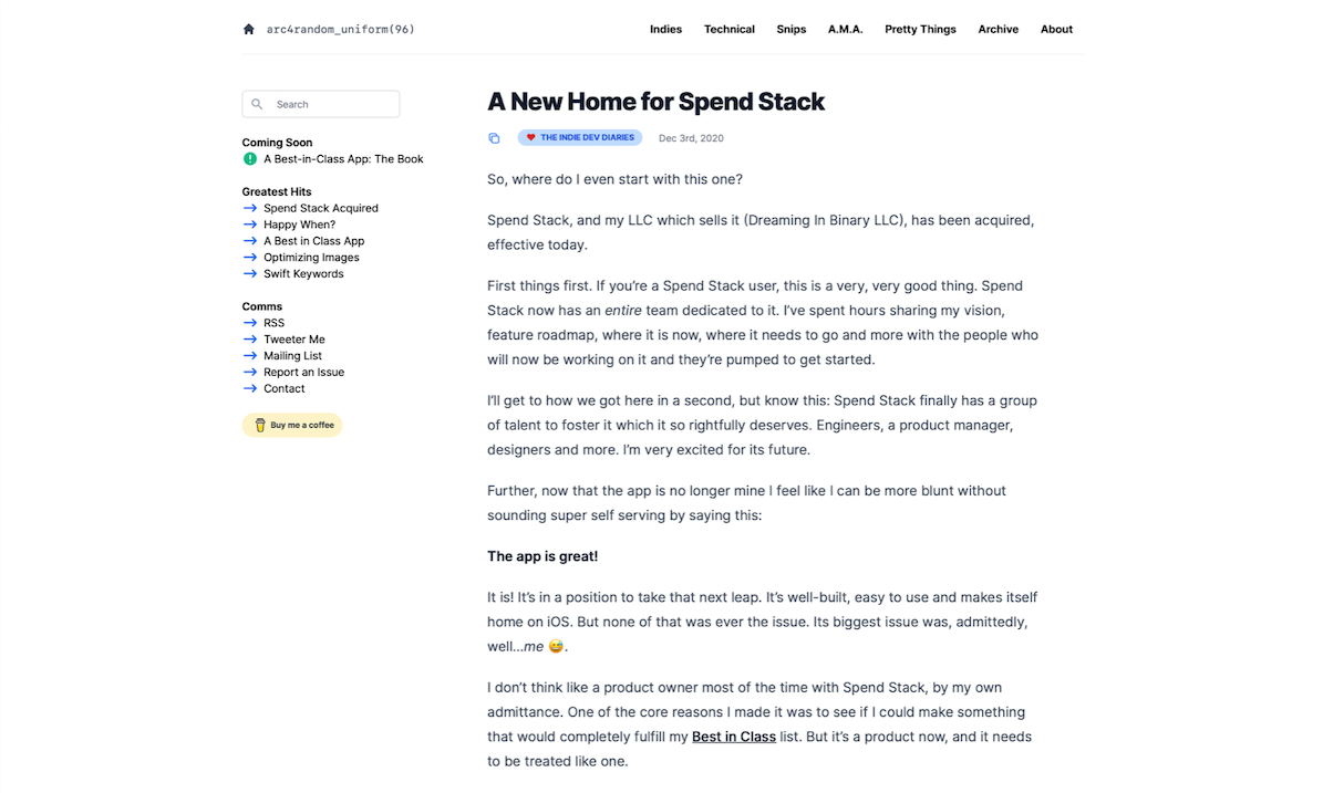
First, let’s compare. Here’s a before and after:


As you can see, a lot changed. Before, my site was as simple as I could make it and I was happy with that. But, as Spend Stack changed hands and I wanted to start writing more - giving this place a refresh became something I really wanted to do. The CSS I had rolled before was just enough, and that was it1. So, I looked at options.
With all of the talk being about Tailwind, I naturally was curious. But people talk in the programming world about shiny things a lot, so it had to pass the smell test. Plus, I’ve been here before with CSS.
Bootstrap is great, except when it’s not! But Bulma isn’t great, except when it is! Even so, after looking at their documentation and resources, it’s clear they are serious about this. It’s not just hanging out in some repo with a few commits. This is their thing, and some other web devs who I trust vouched for it.
I mean, when the docs look this saucy, that’s hook, line and sinker for me:

I rarely look to third party code to solve my first party problems2, but I’ve been doing this long enough to know when to look for some help. And CSS is my help area, I just don’t really want to mess with it. Plus, a website redesign quickly suffers from a “boil the ocean” problem, so if a CSS framework can help me make it work and make it pretty - I’d consider it.
So off I went.
Embracing Utility First Approaches
The fun with Tailwind is the joy it absolutely brings when you use it. Because once you grok it, using other forms of CSS starts to feel archaic, tedious and just a hop, skip and jump away from being an utter sink of energy and creativity. I’m serious!
Let’s look at how I used to write CSS:
.superDuperDiv {
  background: #6EB7E7;
  color: red;
  text-align: center;
  padding: 24px 24px 24px 24px;
}

<div class="superDuperDiv">Here is some content</div>
Certainly, that’s a valid approach that’s been used since the dawn of cascading style sheets. Tailwind asks you to consider a utility first approach, though, and it’s different than what I was used to. Here’s what it would like using Tailwind’s utility first approach given the CSS above:
<div class="bg-green-300 text-red-500 text-center px-24 py-24">
Here is some content
</div>
At first, my reaction to that was no thanks. More code! What if I need this style another place3! How am I supposed to learn those 4,000 utility classes4?
To me, it was akin to arguing that this code for an iOS custom view that would be used in several places…
let aView = UIView()
aView.backgroundColor = .purple
aView.layer.cornerRadius = 4.0
aView.layer.cornerCurve = .continuous
…is more sensible than either of these approaches:
extension UIView {
    func applyStyle() {
        backgroundColor = .purple
        layer.cornerRadius = 4.0
        layer.cornerCurve = .continuous
    }
}

class CustomView: UIView {
    override init(frame: CGRect) {
        super.init(frame: frame)
        backgroundColor = .purple
        layer.cornerRadius = 4.0
        layer.cornerCurve = .continuous
    }

    required init?(coder: NSCoder) {
        fatalError("init(coder:) has not been implemented")
    }
}
Sure, way different tech stacks - but we relate things to what we know. When I started as a youngling in this industry, I found myself unrealistically recalcitrant towards new, drastically different ways of doing things. But as you go on, your ears and eyes open up and listen.
Its developer, Adam Wathan, has obviously thought of this. I decided to put my assumptions aside (on technology that I rarely use in my day to day no less) and hear him out. He lays it all out in a reasonable blog post that you can read here, and I’ll let him convince you if it’s a good approach for you or not. For my money, I prefer to not leave my HTML when writing CSS.
let concatenatedThoughts = """
This framework is certainly opinionated. Sometimes, we take that as a net negative. I don't. Most software, and certainly compelling software, is opinionated. And, like with any opinion, you are drawn to it or you aren't. So when Tailwind says it's a utility first framework, you go with it or you find something else. Neither approach is wrong. It's about finding the opinions that you jive with, while checking your assumptions at the door to remain open to new ones.
"""
Going utility first isn’t a sine qua non when dealing with styling the modern web, but I also don’t want to go back to the other way.
Play == SwiftUI
People asked me along the way what IDE I was using for my Tailwind adventures. Was it VS Code, the new kid on the block Nova from our favorite Mac veterans, perhaps the ever reliable Sublime? My answer, for the most part was…
None of those.
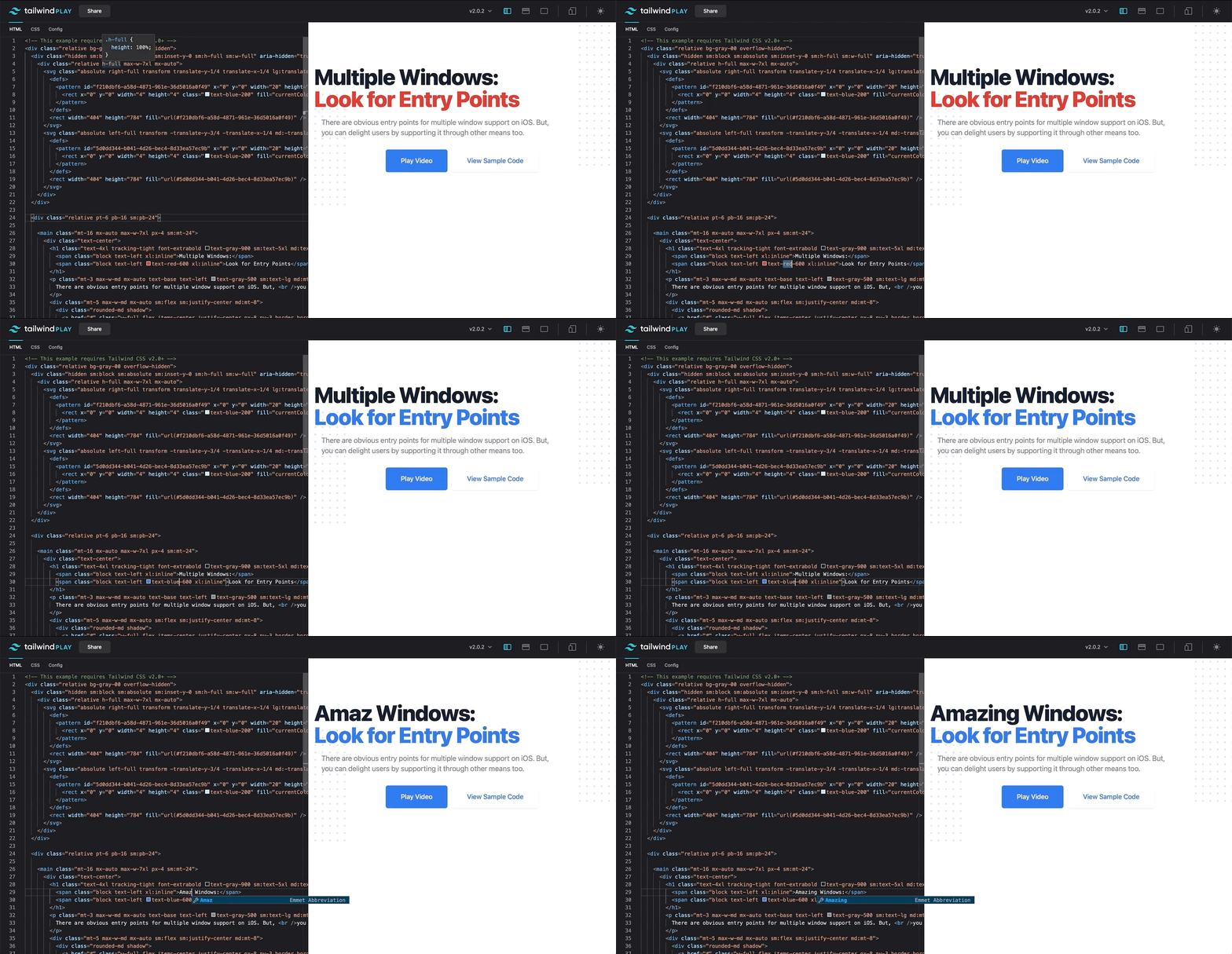
The folks at Tailwind have a playground you can mess around with, and it updates in near realtime. It’s great. With compromises happening on each IDE I messed around with, I ended up using a web app to redesign nearly my entire site.
SwiftUI, if anything, has made my tolerance level extremely low for the code/build/run loop we’ve been used to for so long on iOS. And, with Jekyll, I’m in the same boat with each build taking around 10-15 seconds for any change I make. Maybe an M1 would Moore’s Law that problem away, but for now, I can’t afford that amount of time.
Their online playground reminds me of how I felt when using SwiftUI and its live previews for the first couple of times. I make a change and I see it:

If you’re in the phase of figuring out if this is a framework you want to use, jump in there and mess around. You’ll get a nice feel for it.
let concatenatedThoughts = """
You can even share your work using their playground. For example, here is the markup for my screencast templates.
"""
The Cheat Codes
Aside from being a fine framework, there are some toys that sealed it as a solid direction to take. Since I didn’t want to spend months redoing my site, I stumbled upon another component of Tailwind that made life easy for me, their paid components package Tailwind UI.
Inside you’ll find several designs to get inspired by. Either plop them into your work, or tweak them a bit to fit your aesthetic. For example, the archive section I’ve added was tweaked from a component they had for feeds:

And what I adapted from it:

Since a month or so since I relaunched this very site, they’ve already added 20+ new components. I’m not in the web app game, but if I was - this would be one of the first things I’d reach for in my toolkit.
Aside from that, one thing that can torch your blog is typography. Get the spacing and margins wrong and readability suffers. Use a fancy pants or clever font and then you risk annoying potential readers unless your design calls for it. To that end, Tailwind has a plugin called Prose which takes you from this:

…to this:

…and that’s a beautiful thing.
There were only some minor tweaks I had to make, such as dark mode not being supported out of the box, but those were easy fixes.
Taking a step back here, TailwindUI and the Prose plugin hit that cozy spot of getting a nice, well designed head start that you can tear apart and make completely your own. To me, straight up templates typically don’t cut it, you need a good starting point to remix. That’s what this is to me.
The Hiccups
Perhaps the biggest compliment I gave Tailwind is that its most difficult component isn’t really anything to do with the framework itself. It was installing it, and getting it up and running with Jekyll. But what’s understood shouldn’t have to be explained. And really, that’s a problem with the programming community.
I know Cocoapods, SPM and Carthage like the back of my hands. On the web side, I thought NPM only dealt exclusively with some Javascript framework that did cool stuff on servers. I had zero idea I’d need it to install a CSS framework.
And therein lies our blind spots, something I’m guilty of too. When you go cross discipline, you usually end up down a rabbit hole on how to do the most basic of tasks within that world. But such is life, and our industry.
As such, I’m used to this:
$ cd myProject
$ pod install 'SomethingGreat'
$ Great! SomethingGreat was installed! Please use .xcworkspace and stuff now.
But dealing with N.P.M. felt more like this:
$ Great! You just installed about 9,554,333 things!
$ You might not be sure where they ended up.
I don’t even know what most of this stuff is:

I went with it though. From there, once I got into my project it was as simple as spinning up Tailwind in my blog’s Jekyll directory:
npm install tailwindcss
The trick was figuring out how to get it to play nice with Jekyll’s way of doing CSS. And the answer, for me at least, was to…not get it to play nice with Jekyll’s way of doing CSS. I just refer to it as one normally does, and it sits in my project’s root. It took me a bit to figure out it was as simple as that:
<link rel="stylesheet" href="https://rsms.me/inter/inter.css" />
<link rel="stylesheet" href="/tailwind_css/tw.css" />
With that out of the way, Tailwind includes a little configuration file you can tweak. Usually, I don’t really enjoy another config file, but when I need one I also need straightforward docs justifying its existence and informing me quickly on how to use it. Thankfully, that’s what their docs have. After popping in a few plug-ins from their Tailwind Labs initiative, a quick rebuild is all you need:
npx tailwindcss build
Launch Day
On launch day, I crashed and burned for the first hour or so. Tailwind, being a utility first package, is huge. As such, when you go to production you can use their pruning feature to only take what you need.
I didn’t do that. I took it all!
And what I got was a CSS file over a quarter of a million lines long. After I got the purge functionality working on Netlify, along with a NPM environment variable fix, I was set.
Aside from that, I missed some responsive wins because of course I did. That’s simply an immutable axiom when it comes to web development, something dealing with responsive design will be borked on V1. That’s the one thing with Tailwind’s API that threw me a bit. If you’ve got this HTML:
<div class="sm:bg-green-500 bg-blue-500">
Resize me!
</div>
I would expect the background to be green when it’s small, and blue when it’s not. But in web design parlance, you start small and then go big. As such, to get what I described above you’d do this:
<div class="bg-green-500 md:bg-blue-500">
Resize me!
</div>
And my failure to understand that initially led to some totally whack margins. A quick deploy with a few tweaks patched it right up, and I had missed it in testing because I failed to use Safari’s responsive design mode - instead opting to just resize my browser here and there. That’s like giving the green light to an app that you’ve only tested on the simulator and not a real device.
The only issue to date that I’m really hitting is in my dev environment, my text is smaller (as I’d prefer) but on production it’s a smidge larger. Not a huge issue, but one I still need to dive into.
Final Thoughts
As I’ve often said, being an indie developer means trading off one thing for another. What are you good at? What do you totally suck at? Account for using the former skills while optimizing out the latter.
The “latter” for me? That’s web development. The folks at Tailwind just know what their doing, and that’s evident from their work. I want to stand up a site that looks beautiful, but I don’t want any template or C.M.S. controlling what beautiful should look like. This was the best route, and I think the end result speaks to that.
Until next time ✌️.
-
In fact, it was my first time writing HTML 5. It had been that long since I dipped into the front end world. ↩
-
Spend Stack had, at most, three or four dependencies. ↩
-
You can still achieve this in the Tailwind world using its @apply method. ↩
-
Visual Studio Code has the best autocomplete support I’ve seen for Tailwind, and it was absolutely necessary for me when starting out. ↩
