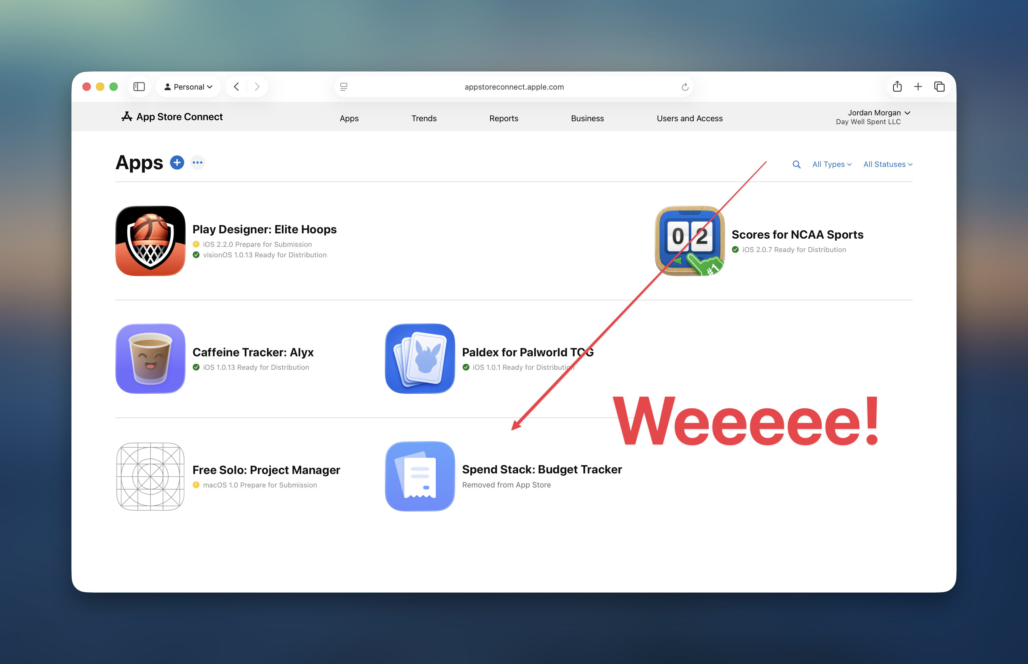
A bit ago, Elite Hoops hit $10k MRR. That’s a mark I would’ve been on the edge of my seat, eagerly waiting for, not even a year ago. In reality, the milestone passed me by. I didn’t happen to notice it until I was triaging a customer issue earlier this week.
Make no mistake, I’m proud! It’s super awesome! But, here’s what I’ve learned:
You hit the fabled #TenKMRRClub before you actually hit the revenue mark. Because, if you’re somewhat close, then you’ve probably already figured out the hard parts of getting there. And for most of us (and there are several, rocketship exceptions), it’s the most boring process in the world:
- You find a pain point. You solve it.
- The first few versions aren’t fantastic, but if people are paying for it, then BAM! You’re onto something.
- Then, as the years go by, you simply don’t quit.
- With a gut intuition, and keeping a sharp eye on your sector, and the people in it, you make the thing better.
And I’m telling you, that’s really it. It’s boring. It’s a process of waking up, and making the product slightly better than it was the day before. I could go on about marketing tips, customer acquisition, measuring ARPU, the lot of it.
But, when I sat down to write this, and I thought to myself, “What would Jordan, three years ago just getting started with Elite Hoops, want to know?”
And the answer? Man, it kinda sucks.
You mean to tell me you simply just keep making the thing better!?
Well, yeah. I do. It’s the best advice I can give, and so many people don’t do it. If people pay for your solution, then where there is smoke, there is fire. So just keep feeding the fire, and you’ll survive:
- The highs and lows.
- The copycats.
- The occasional one star review or refund request.
- The App Store submission that goes nowhere.
- The Reddit comment that swears, with the utmost righteous, unwavering conviction, that there is no possible way your app warrants a…gasp!…SubScriPtiOn!
- The realizations that there’s always a bigger fish, and your success seems diminutive to someone else who may have started last week.
- The fight to constantly resist gilding the lily, and focus on the things that actually might move the needle.
And, eventually, one day you wake up and it just…all kinda works? And, that’s boring, and it’s also true. Three years, tons of iteration, tons of tiny little improvements, the occasional big improvements, and lots of love.
That’s the most boring way possible to 10k MRR.
Until next time ✌️
Epilogue: As an aside, this marks the end of publicly sharing revenue. It started, and has always been, about feeding into the community which has given so much to me. I wanted to give back. Though, as Elite Hoops starts entering big boy “Uh, oh - this is a thing now” territory, I think it’s best to keep the books to myself now. However, being helpful and sharing stuff is something I want to always embody. I plan on sharing more on how to run this type of business, in lieu of raw numbers, and I think that’s just as useful.