As we turn the page on yet another W.W.D.C., things are definitely starting to move in that direction. The one we’ve kinda known was coming, namely:

Granted, I’ve seen this quote taken a little out of context. Apple preceded that statement by saying Swift and SwiftUI are the best way to build new apps. So, what about…not new ones?
Hey oh, UIKit! The framework of yore is alive and kickin’, and of course - better than it’s ever been. Let’s see what Cupertino & Friends™️ have added to the framework for iOS 16.
If you want to catch up on this series first, you can view the iOS 11, iOS 12, iOS 13, iOS 14 and iOS 15 versions of this article.
UICalendarView
A brand new component for iOS 16, UICalendarView brings a lot of power to date related operations. Unlike its counterpart, UIDatePicker, it allows for custom decorations for date ranges, multi date selections, font designs and more:
let calendarView = UICalendarView(frame: view.bounds)
calendarView.calendar = Calendar(identifier: .gregorian)
view.addSubview(calendarView)

let multiDateSelection = UICalendarSelectionMultiDate(delegate: self)
calendarView.selectionBehavior = multiDateSelection
And boom:
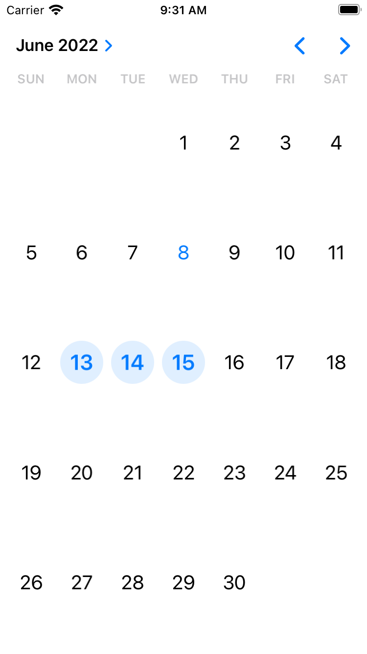
Using its delegate, you can vend custom views for each date. I could see this being especially useful for situations where you want to highlight a range of dates, perhaps with a “selected” background. Or, you could just make everything a rocket ship because you freakin’ can:
func calendarView(_ calendarView: UICalendarView, decorationFor dateComponents: DateComponents) -> UICalendarView.Decoration? {
	return .customView {
    	let emoji = UILabel()
        emoji.text = "🚀"
        return emoji
    }
}
Resulting in:
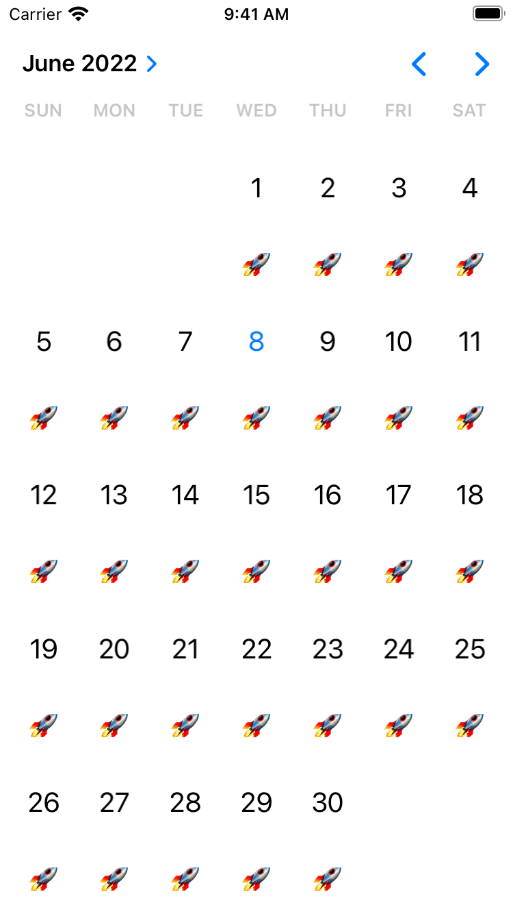
I should note, calendar view works in terms of date components, not Date instances themselves. This is different from UIDatePicker, so it’s something to be aware of before you start plugging it in in place of it.
Read more at the docs.
Variable Symbols
SF Symbols is the framework that just seems to go harder in the paint every single year. I would be impressed if Apple simply added to their collection annually (which they do) but they also add new and interesting ways for us to use them. Right on the heels of giving us different rendering styles, now we’ve got the ability to variably fill them:
let glyph = UIImage(systemName: "water.waves", variableValue: 0.2)
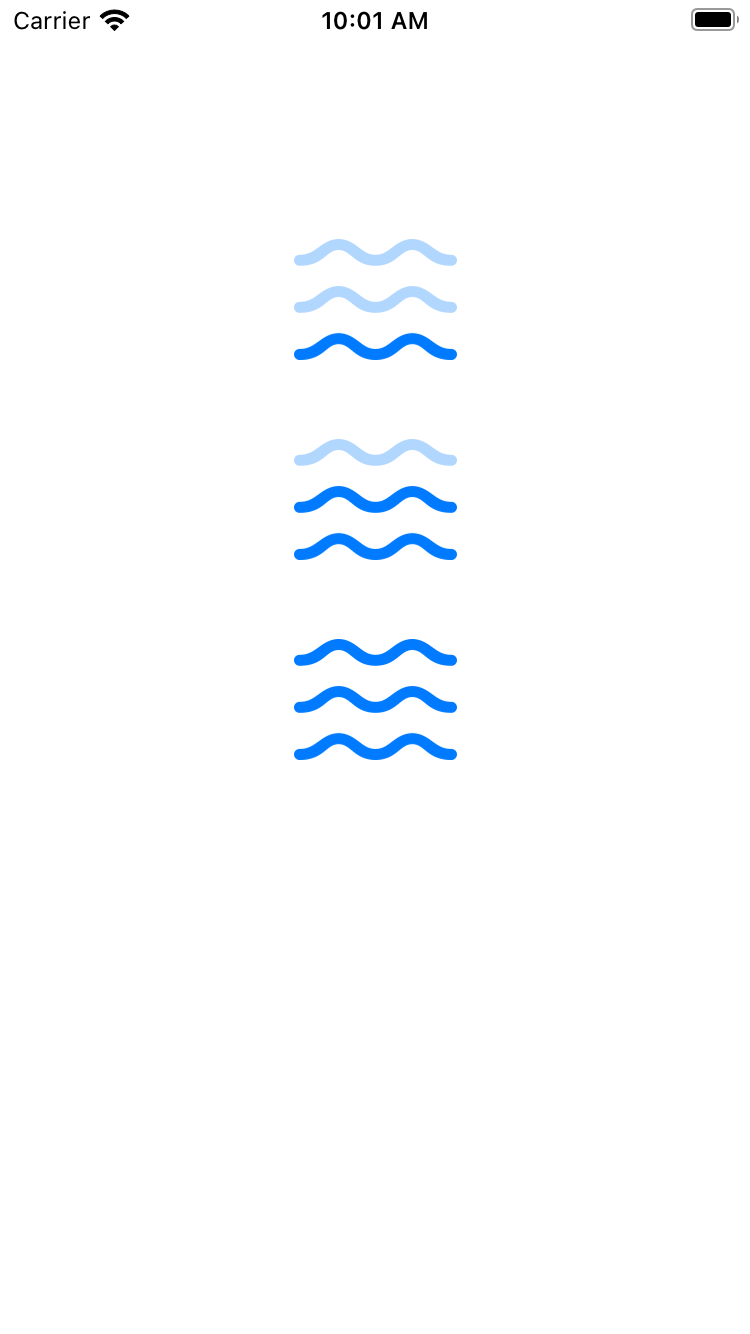
In short, we can “fill” the glyph in based off of a percentage value from 0 to 1. This is particularly well suited towards situations where we are trying to convey a sense or progress or status, for example - showing how strong a wifi signal is, or how much battery you have left. Here is a wave glyph using a 0.2, 0.6 and 1.0 variable fill, respectively:
I see a lot of opportunities to get creative with this API. For example, why not wire up Combine (yup, still love Combine) and change the variance of a glyph to show the classic typing indicator:

It can easily be done:
class ViewController: UIViewController {
    private var subs: [AnyCancellable] = []
    let imageView = UIImageView()
    lazy var count: Double = 0.0 {
        didSet {
            let glyph = UIImage(systemName: "ellipsis.message.fill", variableValue: count)
            imageView.image = glyph
        }
    }

    override func viewDidLoad() {
        super.viewDidLoad()

        Timer.publish(every: 0.35, on: .main, in: .default)
            .autoconnect()
            .sink { [weak self] _ in
            switch self?.count {
            case 0.0:
                self?.count = 0.2
            case 0.2:
                self?.count = 0.6
            case 0.6:
                self?.count = 1.0
            default:
                self?.count = 0.0
            }
        }.store(in: &subs)

        imageView.contentMode = .scaleAspectFit
        imageView.frame = CGRect(x: view.bounds.size.width/2 - 50, y: 100, width: 100, height: 100)
        view.addSubview(imageView)
    }
}
Resizing Cells
In a change that is bound to make those of us who’ve longed relied on UICollectionView and UITableView for years cry a mix of joy and relief, cells now automatically resize themselves when their content changes. Note, resize. We’ve had self sizing cells for a bit now. Now though, for example, if you had a label which was hiding and showing, you no longer have to do the magical incantation of invalidating the cell size, calculating its height or really anything else - now, #ItJustWorks. This is on by default:
collectionView.selfSizingInvalidation = .enabled
Worlds Collide - SwiftUI Views in Cells
Speaking of cells - my goodness, this next one slaps. A common thread among many iOS developers is that SwiftUI is amazing for several tasks, but one that maybe requires the fine-tuned touch of imperative programming techniques is when you have lists or queues that require a touch of performance tuning. You can get in the weeds and do what you need to make things fly.
Now, you can combine the ease of use of SwiftUI with your existing table or collections views. Using the recent content configuration APIs, you can vend a SwiftUI view for a cell. Best of both worlds, as it were.
Here’s an existing content configuration from my collection view snip:
let videoGameCellConfig = UICollectionView.CellRegistration<UICollectionViewListCell, VideoGame> { cell, indexPath, model in
	var contentConfiguration = cell.defaultContentConfiguration()
	contentConfiguration.text = model.name
	contentConfiguration.textProperties.font = .preferredFont(forTextStyle: .headline)
	cell.contentConfiguration = contentConfiguration
}
While that works, now you can do stuff like this:
cell.contentConfiguration = UIHostingConfiguration {
    HStack {
        Text(model.name)
            .font(.headline.bold())
        Image(systemName: "star.fill")
    }
}
Tangentially related, this also solves some of the complexity I felt when content configurations were introduced around creating custom ones. Creating custom configurations is absolutely possible, but it takes a bit of leg work. This, well, doesn’t - and that’s awesome.
Little Nuggets
With iOS’ heuristics always improving, you can now detect money or physical values from data detectors:
let textView = UITextView(frame: .init(x: 80, y: 80, width: 200, height: 200))
textView.text = "Let's chat about how much my apps that don't exist make, $0.00 ARR.\n\nSee them here:
https://www.ihavenoappsrightnow.com/becauseImWritingABook"
view.addSubview(textView)

textView.dataDetectorTypes = [.money, .physicalValue]
textView.isEditable = false
As of now, .physicalValue has no overview, so I’m not quite sure what it’ll detect. Money, however, is straightforward.
Oh - you can size sheet presentations now, yes! Personally, the detents that came out of the box last year had limited utility for my own work, but being able to tweak it so they show exactly how I want is perfect. For example, if I needed a super tiny sheet that’s only 100 points tall now, that’s perfectly valid:
let vc = ViewController()
vc.view.backgroundColor = .purple
vc.sheetPresentationController?.detents = [.custom { ctx in
	return 100
}]

self.present(vc, animated: true)
When you use create a custom detent provider, you can reach into UISheetPresentationControllerDetentResolutionContext to see things like the trait collection or set a maximum value. Neato. Plus, you can set custom detent identifers to use along with all of the properties UISheetPresentationController had before, like setting it for the .largestUndimmedDetentIdentifier property.
More to Discover
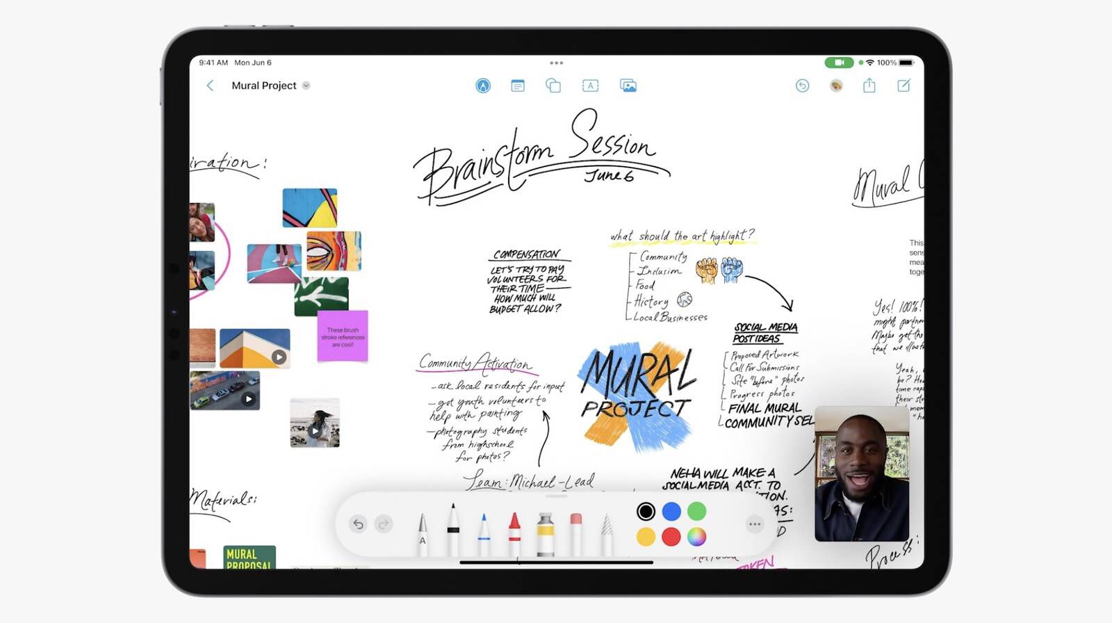
There’s a lot that’s changed with context menus, giving them a substantial amount of power and flexibility in terms of sizing and presentation. Plus, a new paste control, page controls that can be used vertically, find and replace options and a lot has been done to the trusty navigation bar. Now it has presets for specific contexts, tailored for things like document based apps or ones that are more creative and free…form 😉:
Final Thoughts
As we see the inevitable rise of SwiftUI, I can’t help but smile as I write another article in this series each year since iOS 13. Right after dub dub, I immediately see the “Here’s what’s new in SwiftUI” articles hit - and why not? SwiftUI is exciting, and I love using it.
But, for now, UIKit is still here and doing its thing. And, wow - it’s added a lot of great stuff this year. And while it keeps doing that, yours truly will keep talking about it.
Until next time ✌️
