ForEach Thought: Volume 1

This post is brought to you by Emerge Tools, the best way to build on mobile.
ForEach Thought() is a kinda newsletter that has three interesting finds in the iOS space, something I’m coding or designing and an interesting API.
Three Byte-Sized Finds
Quentin Zervaas, of Crunchy Bagel - you probably know them as the folks who develop Streaks, put ChatGPT to good use. Quentin was after a typewriter effect for his release notes, and with little modifications he was able to get just that from it. The differences between the final product and end weren’t miles apart, but rather feet - which is what’s crazy about this whole thing.
His prompt:
Write SwiftUI code that animates a string of text to look type it is being typed in real time
The first result:
import SwiftUI

struct TypingText: View {
    @State private var text = ""
    let fullText: String
    let typingInterval: Double

    init(text: String, typingInterval: Double = 0.1) {
        self.fullText = text
        self.typingInterval = typingInterval
    }

    var body: some View {
        Text(text)
            .onAppear {
                self.typeText()
            }
    }

    func typeText() {
        var currentIndex = text.endIndex
        Timer.scheduledTimer(withTimeInterval: typingInterval, repeats: true) { timer in
            if currentIndex < self.fullText.endIndex {
                currentIndex = self.fullText.index(after: currentIndex)
                self.text = String(self.fullText[..<currentIndex])
            } else {
                timer.invalidate()
            }
        }
    }
}
I’ve certainly authored worse. The more I see from ChatGPT, I’m starting to think that it’s best served as a coding companion instead of a coding replacement. It also makes you wonder what the Stack Overflow folks think about all this A.I. hooplah. If they are considering a response, let’s hope it’s better than what Google came up with to announce Bard 😬.
2: ChatGPT Can Kinda Localize, Too
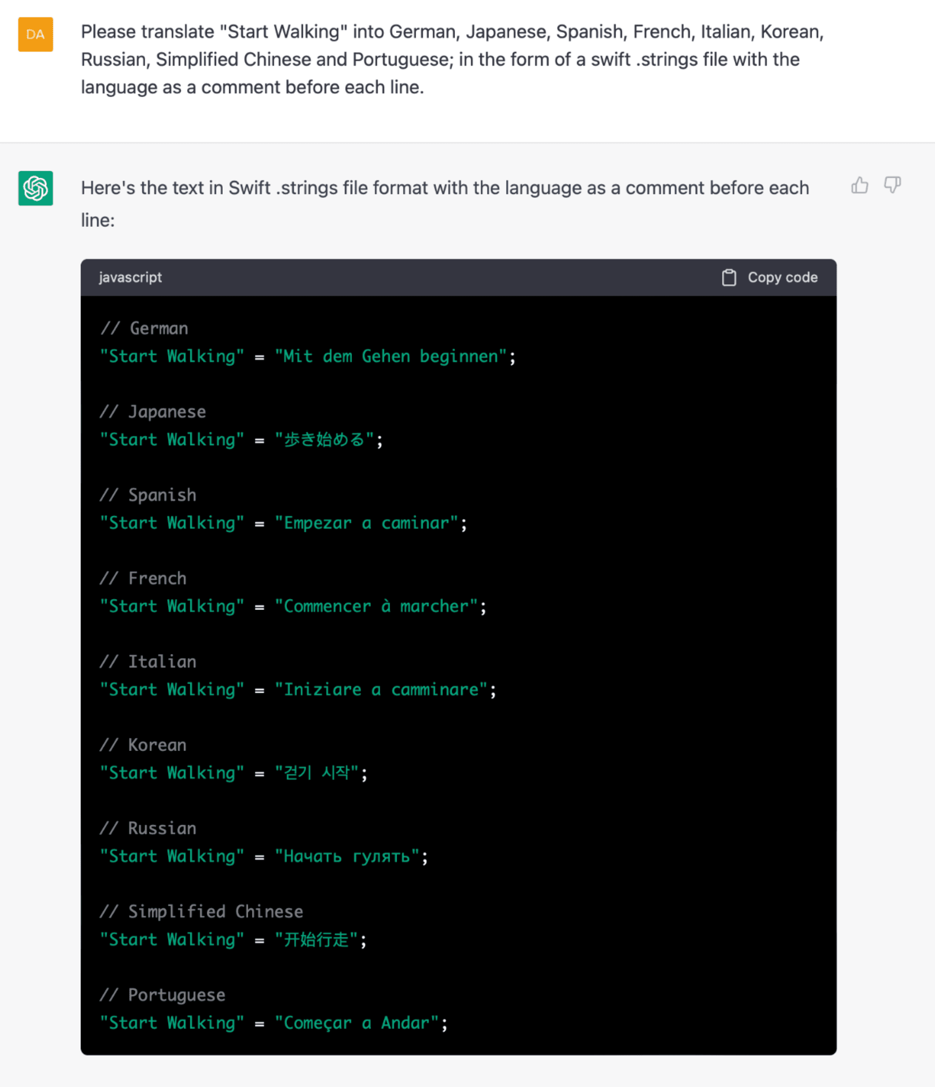
Let’s keep it on ChatGPT for a hot second. David Smith had a fun one - he asked it to localize some strings. And, well, it seems to work:

I can’t verify if that’s correct at all, and David says as much. But for all of the apps I’ve seen lean on Google Translate for the same purpose, this seems like a step up in terms of process, at least - the correctness part is to be determined.
3: The SwiftUI Key Binding I Never Knew I Needed
On that note, David’s Mastodon account is just the gift that keeps on giving. He shared a key binding I now use several times daily. By remapping ⌘+P to refresh the Xcode Preview instead of….print!?…you skip the archaic dance I was doing, which was to comment out a line to trigger a refresh.
Something I'm Working On
Hot dang, if getting U.X. right just isn’t one of the difficult things in our discipline. Even though I’m nearing completion of writing an entire book over it, the dark arts of producing a great user experience still continue to humble me daily. This time, it was all about bar button items. In my upcoming basketball app for coaches, I have two different views that do similar things.
The first is a general, quick-use whiteboard. The second is a more feature-rich “team” view, which also features whiteboarding capabilities. The pickle I found myself in? In a word, continuity.
The whiteboard has its undo, redo and delete buttons in the top trailing position. It’s easy to put them there, in no small part because this view is part of the root navigation flow. There’s really no place to put a bottom toolbar here.
The team view is displayed in a modal context. At first, I had the buttons highlighted below in the right-side image reversed.

The ellipses, roster editor and marker toggle were on top. But! And there is always a but. Upon using it, my wife became instantly annoyed going back and forth between views because the position of those bar buttons changed. The whiteboard has them on top, the team view had them on bottom. I tried to explain the trade-offs, one is modal, one is root level navigation! I have no room! The team view has three times as many bar buttons!
She didn’t care, she didn’t like that buttons that do the same thing in very similar views changed positions. I hate to admit it, but she was right.
My main hesitation was that the ubiquitous “more” button felt very out of place at the bottom. It feels like that should be in the top trailing spot. But hey, open up Photos, and they do the same thing - it’s right there at the bottom:

One Obscure API Observation
Did you know that HStack respects RTL to support out of the box? Of course, I definitely for sure knew that. Basically, there is no need for trickery - this gets flipped for you in RTL languages, such as Hebrew:
// In English locales...
HStack {
	Leading()
	Middle()
	Trailing()
}

// Becomes this automagically in RTL locales ✨
HStack {
	Trailing()
	Middle()
	Leading()
}
Apple out here making a11y life easy, as it should be.
Until next time ✌️