ForEach Thought() is a kinda newsletter that has three interesting finds in the iOS space, something I’m coding or designing and an interesting API.
Three Byte-Sized Finds
1: More Open Source Projects of Yore
Sophia Teutschler has open sourced the code for a throwback app, Groceries. Remember this one?

I love seeing older projects live on like this. Obviously this hits home for me, having recently made Spend Stack open source. If you browse though Groceries source code, you’ll see relics from another time. App delegates, block based logic, swathes of Objective-C, pointers and more! It’s astounding to see just how much of the tech stack has changed to create an iOS app now. New language, new user interface framework - it’s all different.
2: There are a lot of ways to use Shortcuts
I was reading through Culture Code’s announcement for their new Shortcuts in Things 3, and I realized just how many ways there are to invoke a Shortcut in the Apple ecosystem. Even as an iOS developer, I didn’t quite grasp how many entry points there are.
Seriously - can you name them all in your head? Try right now.
As noted in their blog you can perform a Shortcut via…
- The Shortcuts app
- Use widgets
- The menu bar (macOS)
- The dock (macOS)
- Keyboard shortcuts (macOS)
- Spotlight
- Your voice (Hey Sir…)
And, as of the latest iOS 16 beta, you can add Lock Screen widgets to that list. Verily I say unto you, my friends - there’s never been a better time to dive into Shortcuts. And, with the release of App Intents making the job comically easier than it was before, it’s fairly easy to stand one up.
3: Another Depressing App Rejection Saga
I hate reading these posts, and I hate even more that they happen. Look, I get it, the App Store is huge - but it also should have the necessary resources, and training, to match that surface area. The developers who pour their heart and soul into their apps to release on Apple’s App Store (to the benefit of Apple too, I might add) should never be told the following (emphasis my own):
During our review, we found that this app duplicates the content and functionality of other apps submitted to the App Store, which is considered a form of spam and not appropriate for the App Store.
Not much else to say here other than, yes - let’s absolutely keep the bad apps out, but let’s get the good apps in without issue. Here’s hoping Lucas gets things sorted, and we don’t run into another embarrassing Ice Cubes situation.
Something I'm Working On
I’m closing in on launching my first app since Spend Stack (it’s an app to help basketball coaches share plays). It’s extremely exciting, but this time I’m doing a lot different. Namely, I’m embracing my inner Jordi Bruin and getting it shipped before it’s perfect.
And, wow - that is haaaaaard for me, but I think it’s an important exercise. There are so many rough edges I want to smooth over, but I know the core of the product is there - and I’m not gonna learn more until it’s out in the wild. This is the opposite approach I’ve previously taken, wherein every inch was polished to my liking before it hit the App Store. Missing some features? Sure. But pixel perfect? Yup.
There is a line I’m trying to find, and it’s somewhere between “This looks good enough” and “This looks exactly how I want”, but in that space - there is opportunity to release quicker. So, I’m embracing shipping faster in exchange for the U.I. looking up to my (probably too lofty) standards. I haven’t really tried this and I should. Spend Stack was beautiful, but it also cooked in the kitchen for far too long and never found product market fit. Can I avoid that this time? Hopefully.
Case in point: The onboarding and paywall. I’m not in love with where either of those are at, but I know they are at good enough to launch, and so - I’m going to launch them.

The paywall, in particular, was a huge sticker. I want to make you want it! In the end, and after several iterations and discussions with indie buddies, I realized that a point list of features along with the name is “good enough”, so I’m just rolling with it (for now). It’s a new muscle I’m growing, shipping something I’m not particularly proud of - but that also needs to just get out of the door.
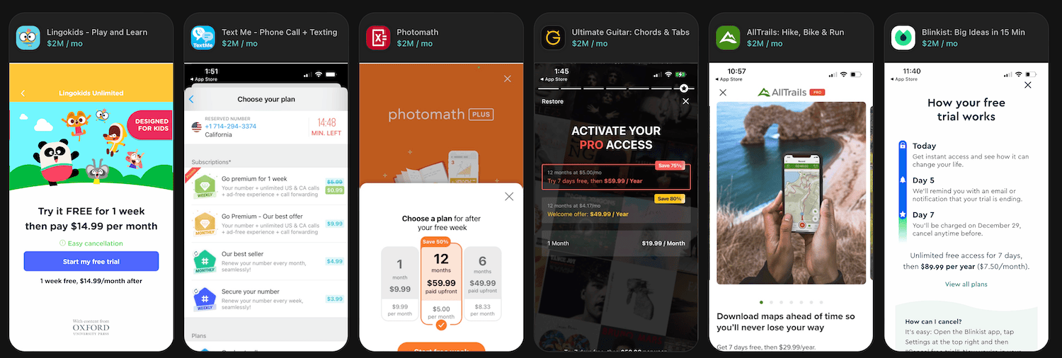
As an aside, if you look at some of the biggest earners in the App Store, almost all of them seem to spend zero effort on a spiffy design for their paywall. Maybe there is something to that? I wouldn’t call any of these designs particularly pretty, but surely they must convert?

One Obscure API Observation
Mark Moeykens is always tweeting random, super useful SwiftUI tips. Here he is coming in clutch with a nifty solution I wouldn’t have immediately thought of. Here’s the scenario: You browse through SF Symbol’s expansive catalog of iconography, and you realize you want a particular symbol with a badge. The new multicolor rendering icons are perfect for this:

But if you can’t find it, are you really out of luck? He shares a little “obvious-but-yeah-that-does-work!” methods to get a nice little badge, no matter the icon you use by simply applying another SF Symbol as an overlay to the original one:
Image(systemName: "cup.and.saucer.fill")
    .overlay(alignment: .bottomTrailing) {
        Image(systemName: "plus.circle.fill")
            .symbolRenderingMode(.multicolor)
            .imageScale(.small)
            .background(.background)
            .clipShape(Circle())
            .offset(x: 4, y: 4)
    }
Until next time ✌️
