What's A Best-in-Class macOS App Look Like?

This post is brought to you by Emerge Tools, the best way to build on mobile.
I’ve spent several years of my adulthood attempting to define something that really can’t be fully defined - what is a best-in-class iOS app? Though I’ve written, to this point and will forever more, exhaustively on the topic — whether that be check lists, GitHub issues, blog posts and oh yeah, a five book series over it - I know that in the end, what makes software amazing is found somewhere between hard and fast definitions and the abstract.
Even so, at this point, I have a good feel over what I’d consider quality iOS apps. However, these days, I find myself pioneering new frontiers (new to me, at least) in the form of macOS development. And, to nobody’s surprise…
…things are different here.
Which naturally has led me to wonder, what does a best-in-class macOS app look like? Further, how would I figure that out?
I’m a nascent macOS developer, and I spend most of my development time learning the intricacies of AppKit, its parallels to UIKit to help me learn it and of course - booking up on the platform’s design conventions. Even though I’ve been a OS X/macOS user since 2006 and I know what I think great macOS software is like, translating that to code has been humbling.
So to this point, here are some places I’ve looked to learn more about what quality macOS software looks like, behaves like and feels like.
Indie Developers
My first natural stop in service of learning more about macOS development has been frequenting projects from the people who have made macOS apps for a bit, and have been making them well. More recently, I discovered a great post from Hog Bay Software, who recently shipped a wonderful outliner, Bike - that covered this topic. It states a few quick tests to run, centering around a few test files:
- Open “Moby Dick”. Fast?
- Scroll to end. Resize the window. Fast?
- Scroll to middle. Resize the window. Fast?
- Select all. Cut, Paste, Undo. Redo. App still standing?
- Edit some content near the middle. No typing lag? No scroll jumping?
- Repeat 2-5 until you get bored, then open macOS Activity Monitor and see if it’s using acceptable amount of Memory.
Seems sound - I know several apps that would crater such a digital workout already. Moving on, how about the work from Ranchero Software? Brent Simmons has been at the macOS game for decades, and his work shows.
The best part? He builds an incredibly well done RSS reader, NetNewsWire, publicly with volunteers. All of the code is laid bare right on Github:

This has been a fantastic resource for me, since I’m at the stage where I often run into many “How on earth do I….” questions. I can pop open that repo and usually find the answer rather quickly.
Indies are an invaluable resource to learning about how to respect a new platform you’re developing for. They are the true artisans of its software, and they will always sweat the details. These are the mac assed mac apps, and if I’m going to make a mac app - it should be, too.
My kinda people.
I’ve met several macOS indies already, and I must say - all of them have been willing and eager to help me along with macOS development. They are simply great people.
Pundits
People in the arena who care about the subject matter are another sensible place to look. Even though they may not necessarily write software for the platform, they do know what great software on it looks like.
For example, I often frequent John Gruber’s suggestions for software he enjoys. By the same token, if MacStories posts a glowing review over an iOS app, I’ll likely enjoy it.
As such, I try to pay special attention to things they call about software they recommend. There are obvious themes, of course, but I still learn something each time I dig into a review or post about a new app.
In an age where we praise native mac apps for just existing due to Electron’s rise (i.e. this app isn’t a memory hog, it’s fast, etc) I want to go further than that. All software should respect the system, but what qualities can you include in your own apps beyond that? Folks in the space who write about it for a living can often clue you in.
macOS Human Interface Guidelines
Ah yes, the HIG. This is absolutely required reading when it comes to learning about Apple’s platforms. Anytime a new developer messages me and asks “How can I learn about designing iOS apps?”, the first thing I do is point them to iOS’ human interface guidelines.
While there are some who are quick to air their grievances about the HIG’s current state by pointing out what it used to be…

…as a newcomer to macOS development, I’ve found it to be my single most valuable resource. This is doubly true since Monterey updated many conventions when it comes to macOS design, which has been nomenclature that has worked to my benefit since many of the updates seem more inline with my comfort zone of iOS.
let concatenatedThoughts = """
In fact, you can peruse that timeless text yourself. That version of the guidelines persists online, and it's been uploaded as a .pdf right here.
"""
One thing that can be hard when getting started with macOS development is simply figuring out how to ask questions. And, you don’t know how to ask the right questions if you don’t know the lingo behind the platform.
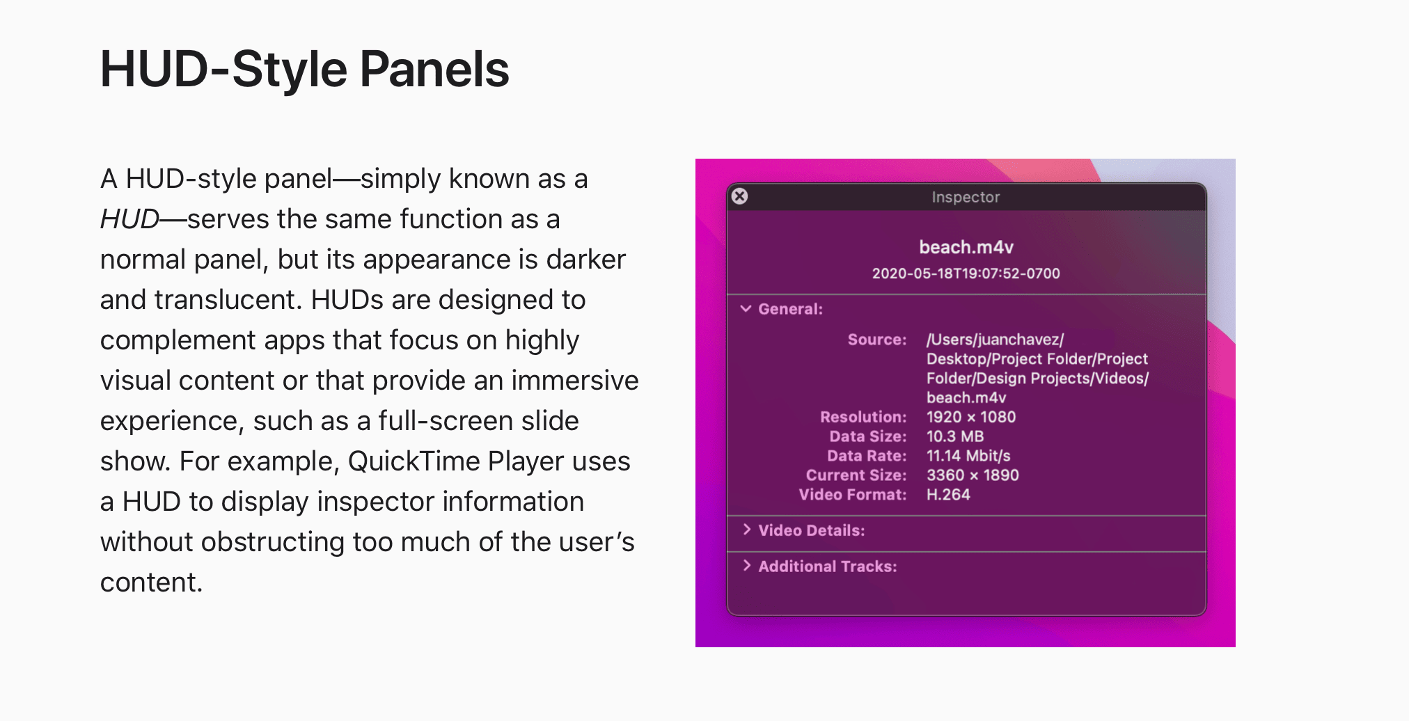
Before reading the HIG, I knew what a HUD-style panel was, its purpose and when I might use one:

But, I didn’t know exactly what it was called. Lipso facto, if I had attempted to Google answers about it, I wouldn’t exactly know what to query for. The HIG has given me a vocabulary for macOS controls, and that is essential.
More than anything, the HIG has helped form my mind to think in macOS terms. Flexibility. Customization. Focused. Capable. You need a north star when creating any soft of software, and the HIG is where I’ve calibrated mine.
Apple’s Stamp of Approval
Another straight-to-the-point way to learn about best-in-class macOS software is to simply look at what Apple says is good. How novel, right?
Last year, Nova from Panic was nominated for an Apple Design Award. So, that’s obviously a great app to dissect and study:

Another Apple Design Award winner, found on iOS as well, was Craft Docs (a personal favorite of mine). I manage all of my own notes and ideas in it, and I enjoy every second of it:

Anytime Apple says “This is best-in-class”, I treat those apps like a study guide for a final exam coming up. I absolutely devour them. How do they feel? Are there similar conventions? How are they flexible, focused and capable? What makes them that way?
After thinking on that, I translate those themes into my own software - the same approach I take to designing and developing iOS apps.
Oh, another thing - looking at the featured section in the Mac App Store is another no-nonsense avenue to find software Apple enjoys:

The Je Ne Sais Quoi Factor
Finally, I try to find those little nuggets, typically in the form of APIs, that seasoned vets wouldn’t dare miss but would immediately notice if they were omitted from my own app. I have no idea what that list should be right now, but here are a few things:
- It includes a help book.
- It supports tabbing.
- Full keyboard navigation and interactions.
- Respecting macOS preferences for things like accent and sidebar icon sizes.
- Being scriptable via AppleScript1.
- What else??
This list will and should be robust before I ship, because these little nuggest of API are what absolutely make me tick when creating software. Just the other day, I recently had a out of body experience when I realized the Quick Look framework provides a delegate function that gives you a beautiful custom view controller transition:
What!! I was today year's old when I realized you can use the QuickLook framework to perform this custom view controller transition for you....
— Jordan Morgan (@JordanMorgan10) May 18, 2022
....with one delegate method 🤯
I have written this transition myself several times, and it is *not* trivial to get right! pic.twitter.com/HWgmmcGVwK
While that’s an API for a transition and less a supported system feature kinda thing, the point is - I don’t want to miss stuff like that in macOS.
Postscript
Anyways - this is all in service of my next app, which I am extremely excited about. It’s been just about two years since Spend Stack changed hands, and I’ve been eager to get back into the game. I can feel it in my bones, ya know? Most days I wake up and I feel like I was just born to do this stuff, and I can’t wait to ship.
I hope when my project (which is still a ways out from being revealed) ships, it’ll earn the title of a well done mac app.
Final Thoughts
If I’m gonna ship anything on any platform, you can bet the house I’m gonna do my best to bring the heat. It’s my biggest advantage as a developer and worst enemy as an entrepreneur, as taking a year to launch is more my jam than weeks. Alas, I embrace it.
So here’s to discovering what a wonderful, best-in-class macOS app looks like, and even moreso to many of us newcomers developing more of them 🍻.
Until next time ✌️
-
I mean I guess? Its role is murky to me with the rise of Shortcuts. ↩