My Real Challenge with SwiftUI

This post is brought to you by Emerge Tools, the best way to build on mobile.
Before I begin, this is not one of those “Is SwiftUI ready for production!?” or “SwiftUI is just a buggy mess” posts. I can make my stance on those topics rather clear:
- Yes, it is.
- And, no, it’s not.
I am a very happy SwiftUI developer. In fact, at Buffer we’ve shipped no less than four major features built using it - all at a blistering speed made possible by the framework. So if you’re expecting a bash post full of hysterics, the exit is at the upper right of your browser tab 👋.
What this post is, though, is an honest assessment of my biggest challenge with SwiftUI.
And, it’s not that it works in ways I don’t expect. It’s not that it’s unreliable or too fragile as others have posited. It’s this:
SwiftUI simply gives me indecision and pause while developing software.
That, by a wide margin, is my biggest hangup as an iOS developer. Not the freedom of choice two interface frameworks bring, but the constant juggling I’m having to do with UIKit and SwiftUI to use all of the amazing APIs that Apple has to offer.
The indecision and pause comes from the simple fact that some of the frameworks do things that the other one can’t. That’s it. And, I’m talking about the little quality of life improvements iOS sees year over year. So, why is that such a sticker for me?
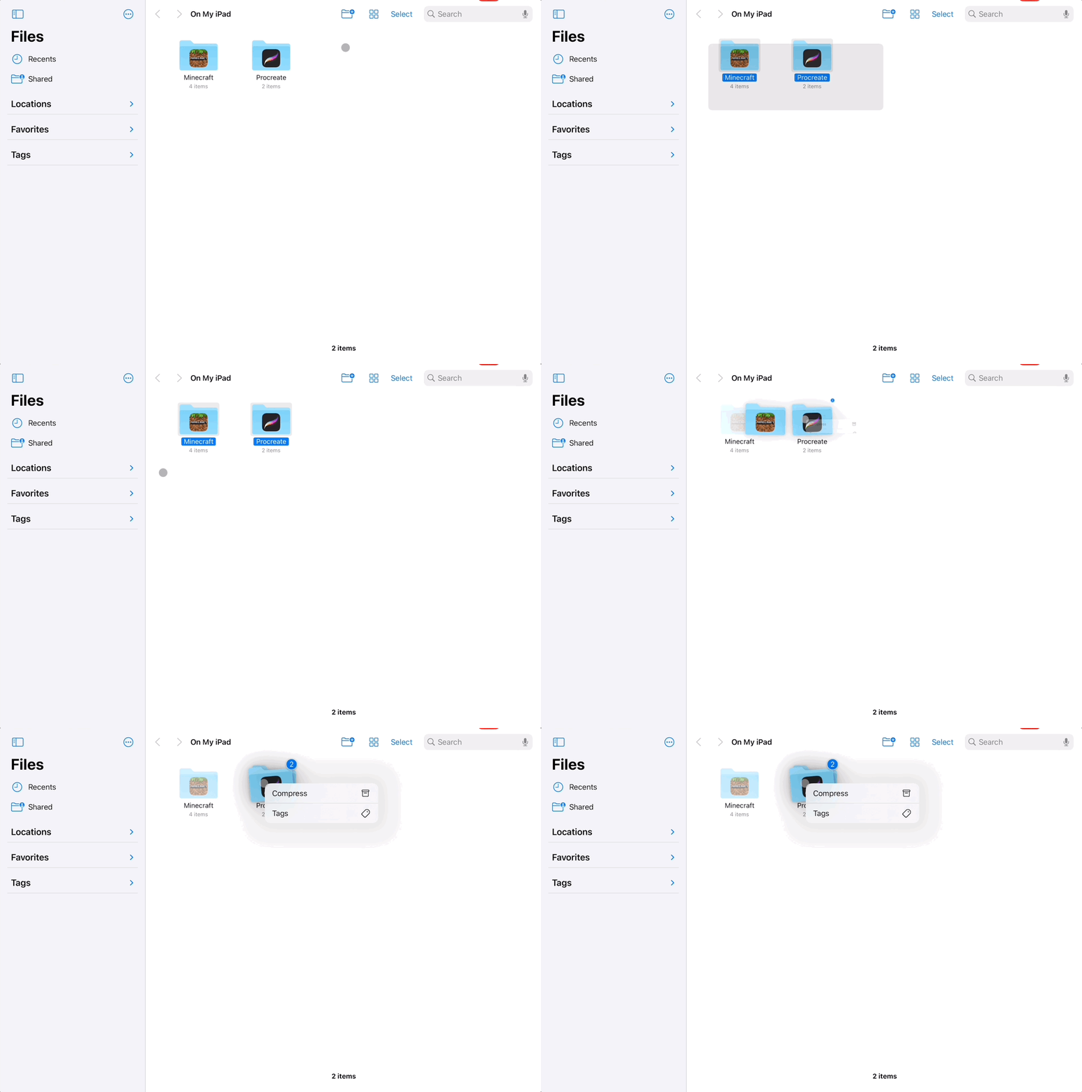
Well, do you as a consumer want to select a bunch of stuff at once on iPad? Or, said differently, do you as a developer want to support band selection patterns like this one:

Of course you do! One thousand times yes. That’s the sort of thing where if an app I was using didn’t have it, I’d immediately notice and think that the developers didn’t care, know the platform well or perhaps were using some other means to build their iOS app (i.e. React Native).
But, these days it might not be due to any of those reasons at all. To wit, the reason it won’t be in my next app is simply because I can’t. It’s not available in SwiftUI1.
Now, let’s hop over to the other side of the fence. How about out-of-the-box markdown? Simple in SwiftUI, almost criminally so:
struct EZMarkdownView: View {
    let markdown: LocalizedStringKey = """
**Incredible Offer**
Visit this [link](https://bestinclassiosapp.com) to claim your discount!
"""
    var body: some View {
        ScrollView {
            Text(markdown)
            .padding()
        }
    }
}
Done. But, that doesn’t fly in UIKit as far as I know.
Now, extrapolate this out a bit. How about the new context menu preferred element sizes, custom iPadOS pointer shapes or accessories, customizing the edit menu in text views - the list goes on.
These are things of which I’m fairly certain you simply cannot do in SwiftUI today. And that hurts because, to the surprise of nobody who has read this website at all before this moment, this is the crap I absolutely freakin’ live for when developing iOS apps. These are the sort of things that keep me up at night, knowing I shipped an app without them.
To demonstrate, I think Spend Stack was one of the first apps to support, or at least advertise, support for a new multi-select pattern introduced in iOS 13. I remember it getting a five to ten second callout in a W.W.D.C. session and my heart skipped a beat, I couldn’t wait to implement it! In fact, I had a silly tweet showing how to do it in Mail, and it went TinyViral2. Not long after, it was turned into an article at The Verge:
Too many 3rd party apps sleep on this pan gesture to bulk select, which is a shame because it’s a great way to quickly select stuff.
— Jordan Morgan (@JordanMorgan10) March 18, 2022
Super easy too:
func collectionView(_ collectionView: UICollectionView,
shouldBeginMultipleSelectionInteractionAt indexPath: IndexPath) -> Bool pic.twitter.com/SI7YzqNg3y
So, for a lot us, being a great platform citizen is dearly important. It’s what makes the platform the amazing place that it is today. Compromising by missing some of those things is not something indie developers should have to do, and I certainly don’t want to.
To that end, we reach the second pain point I have - which is that some of these APIs are available in both frameworks, but it’s hard to know that because the documentation is segmented by SwiftUI or UIKit. This makes sense by most accounts, but if one “core” feature of the platform is available in both, please, please Apple - just link to it from each page.
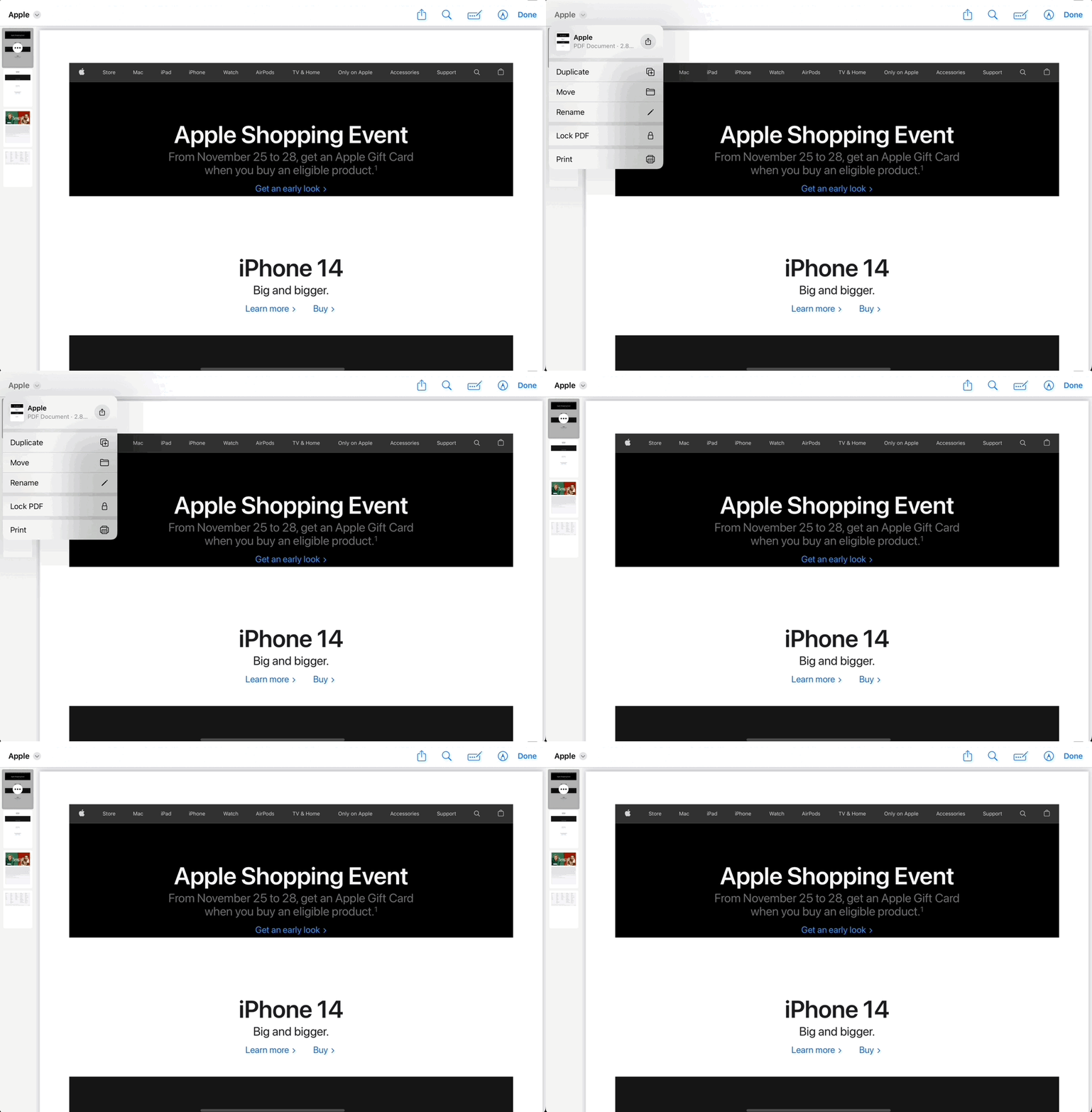
Example? The slick new document editing features on iPadOS:

I googled, wildcard searched, browsed the developer app transcripts, looked at notes and more to figure out how this worked in SwiftUI. I found it in UIKit here. In fact, I only found out this was possible in SwiftUI due to Twitter. And, well, we all know how well that place’s future is looking these days.
If Apple would just link to the “Here’s how it’s done in SwiftUI”, or maybe “To implement X in SwiftUI, please see Y” and vice-versa, that would already be a huge win for me. The same goes for W.W.D.C. session videos. Even if the video only covers the “thing” in UIKit, at least call out that it’s possible to do in SwiftUI.
It’s not a crazy idea either. Look at the standup, quality work that the Apple designers have done with their Human Interface Guidelines this year. They centralized them in a way that makes sense. They present a big idea, and then link to more details for each respective platform.
I realize that design guidance and technical documentation don’t directly overlap, but I still stand behind the spirit of the point I’m trying to make. And that is, if I can do the cool new thing in both frameworks, make it stupid simple for me to know that, no matter which interface documentation page I end up on.
In summation: Core, central U.X. flows and features should be in both interface frameworks from day one. New enhancements to find and replace, iPadOS pointer stuff, band interactions, pencil interactions - all of it. I want to be able to do all of those small little things in both worlds.
What I’m not saying is that I should be able to build widgets in UIKit. From the start, Apple has been clear in saying “This is only done in SwiftUI.” But, if that is not the case, then the API surface area has to cover both worlds.
And, again, link to both frameworks in the documentation if it can be done in either SwiftUI or UIKit. Ditto for session videos.
Final Thoughts
When I see see something amazing at the next dub dub, I don’t want my first thought to be “Will I only be able to do this in UIKit or SwiftUI?”
While Apple has done phenomenal work with interop, I want that to be a bridge solution. It’s true you could wrap this or that to get X or Y to work, as is the case with my first example with band interactions. But, I’m kind of hoping for a future that provides all of these APIs whether or not I use SwiftUI or UIKit.
No matter, I remain a huge fan of SwiftUI. Once you stand up a U.I. in it, it’s almost painful to do the same thing in UIKit. Then, there are times where I need to prod and pry precisely at some code, and I happily turn to UIKit. So, if we’ve got both frameworks, and both aren’t going anywhere - then both of them need to be able to do a lot of the same things.
If the story of SwiftUI is that you can do the big and large things in it (i.e. make an entire app), but you can’t polish off the remaining 10% (i.e. use band selection to quickly select a bunch of stuff) unless you use UIKit, that’s honestly not an ideal story. It’s almost more of an indictment.
So, as the stereotypical phrasing goes, I criticize the platform because I feel so passionately about it, I care about it a great deal. Here’s hoping that the new “small things” APIs end up in both frameworks next year.
Until next time ✌️