Indies always have to divvy up time in uncomfortable ways. For many, the apps that make their way to the App Store are the result of a “nights and weekends” project. Things get cut and releases typically stay slim.
One of the typical cuts?
The “F.A.Q.” section. The dynamic support page. The “Get Help” or “Tips” experiences.
I’m no stranger to this phenomenon either. Back when I had Spend Stack, I dreamed of having something similar to iOS’ Tips apps within the app itself:

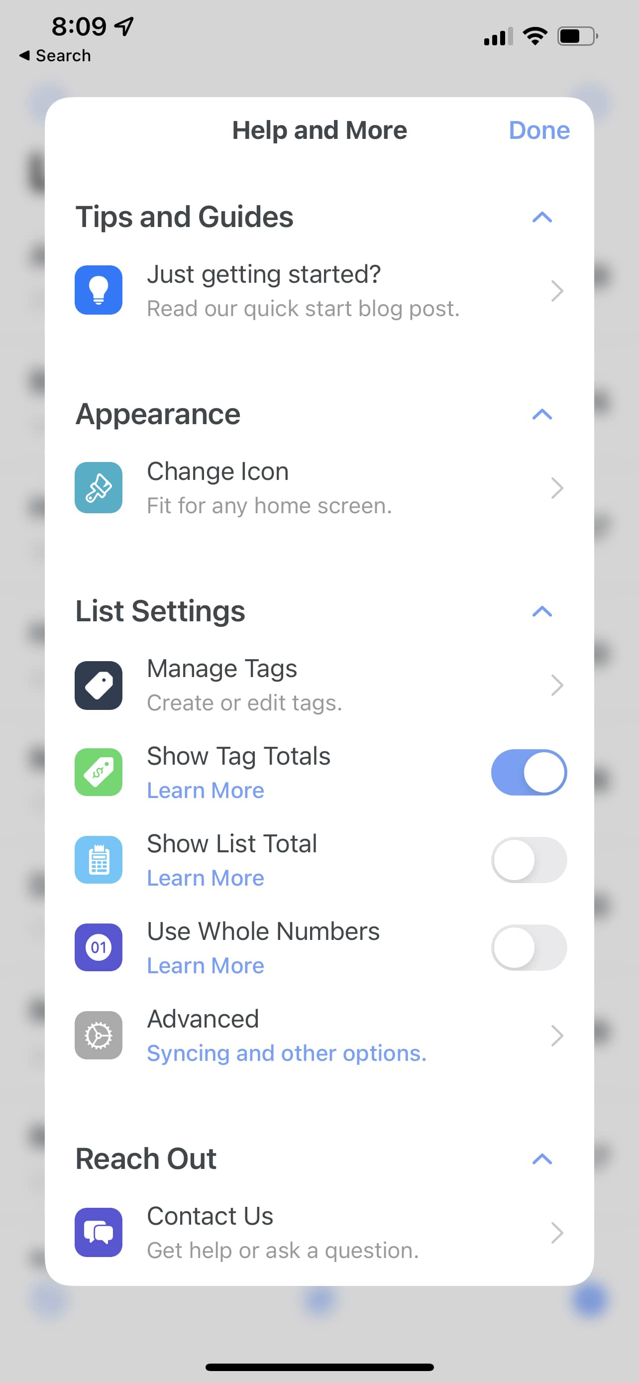
The best I could do, given my constraints, was to link to a blog post within its settings that generally explained the main points and purposes of the app1:

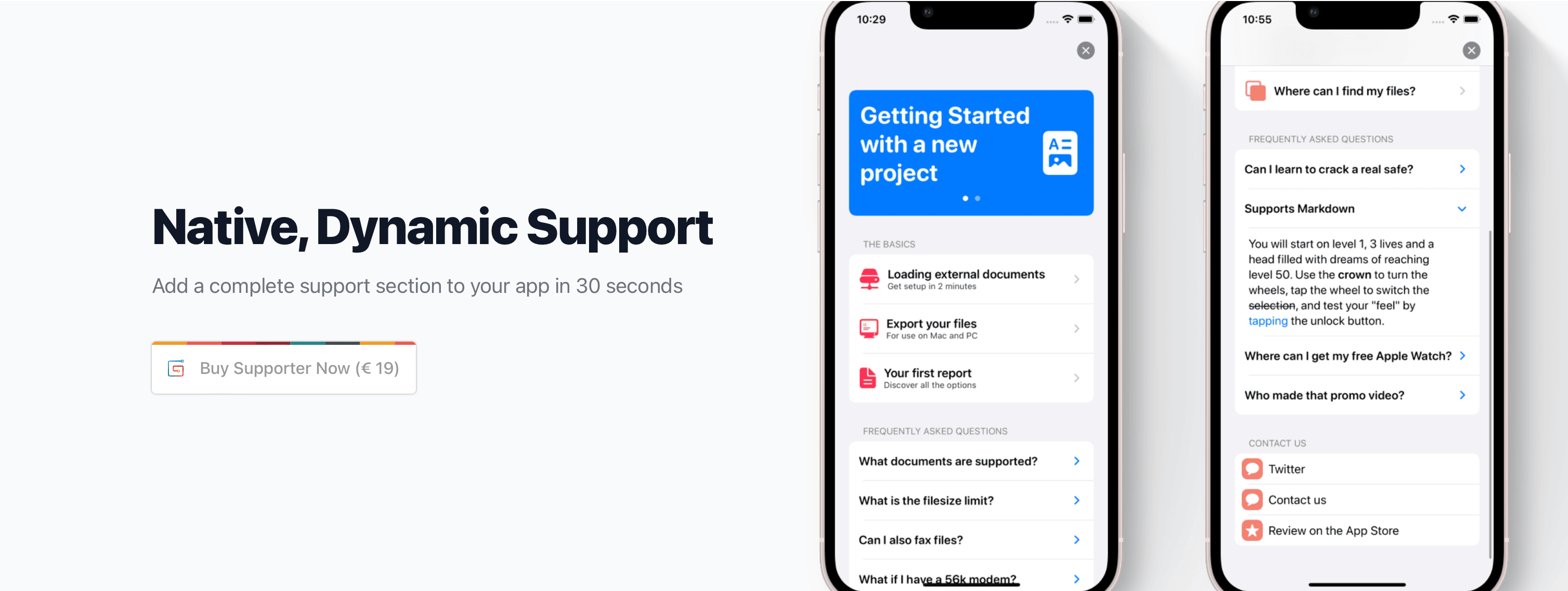
Fast forward to today, and within the span of a few weeks I’ve seen two homegrown, capable “Support” apps created in house. One, from Jordi Bruin, is even available to purchase and use in your own app:

By design, this one looks and feels like the aforementioned Tips app that Apple is shipping today. It’s driven from either a local or remote json store, keeping it dynamic so it can adapt to any app’s changing feature set or obvious question marks people have. Very nice.
On the macOS side, you’ve got Quentin Zervaas (developer of the popular Streaks habit tracker), who made his own mac app to build out help topics which are brought into Streaks’ Help menu:
Here’s an internal app I built using Mac Catalyst, specifically for building help topics for my iOS apps.
— Quentin Zervaas (@qzervaas) January 31, 2022
* Supports multiple apps
* Multiple localisations
* Organise topics by categories
* Markdown
* SF Symbols (and any other images) pic.twitter.com/CA736jYUvT
So, two well done solutions to what I’ll call the “Support Page” problem. Surely, more to follow. These are just two that I’ve had come to mind, but I’ve seen more — and I’ll keep seeing more.
What changed?
Put shortly, two of Apple’s biggest bets: SwiftUI and Catalyst.
One provides speed and execution for projects that used to take weeks2. The Support Page problem can be an afternoon hack session now as opposed to a month long slog. The latter opens up doors for so many of developers, like myself, who cut their teeth on iOS. And now, the big scary door to macOS development has been blown wide open up to us without the AppKit bouncer standing in front of it.
We can wax poetic about the burden and the benefit both of the tech stacks bring with them. Whatever. For my money, I’d say that these tools are working, and we’ll see more output from developers because of them.
Until next time ✌️
