Too often, we miss what I would consider easy-to-find errors in iOS design. I’ve done it a countless number of times, and after getting frustrated with booting up a new build and seeing something look slightly off on just one device - I decided to figure out a way to catch these types of nuisances early on.
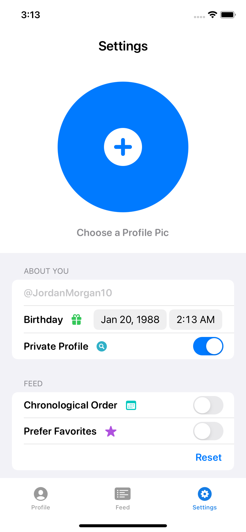
Imagine: You just made a sign up view. You love it, and it looks perfect on iPhone 13:
And then, it goes out (which can happen as an indie, because the Q.A. department is usually…you) and you see this:
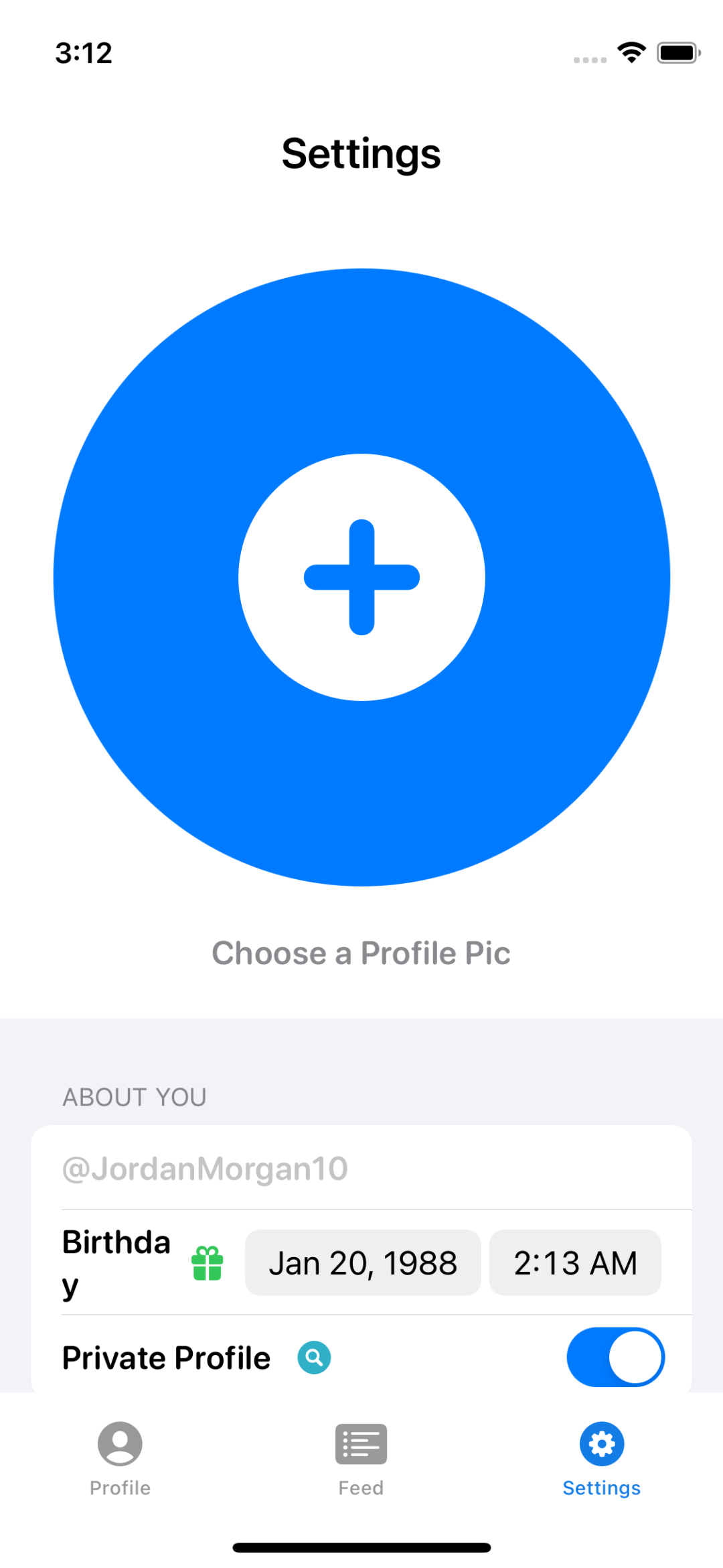
Wupps. The profile picture button dominates the entire interface, and the perfectly sized options below that used to fit the view just right are now bunched up and require scrolling.
Simply put, this is one of those times where you need to make your design do what you meant, not what you did.
let concatenatedThoughts = """
Speaking of, this little example is from the Best-in-Class iOS App book series. Specifically, the design book. Check it out if that's your thing.
"""
To avoid this, I have a set of steps I follow. It’s simply consists of testing your design using a minimum, middle and maximum environment. And then, for each of those, crank up the Dynamic Type setting to its minimum, middle and maximum settings.
That gives you nine variations to test for each screen (yes, iOS - this excludes iPadOS, a topic for another day). Below, I’ll list out what that would look like for our example design above. If you’re using SwiftUI, this is the exact code I use to design with this method:
extension PreviewDevice: Hashable { }

struct BrightView_Previews: PreviewProvider {
    static let sizes: [ContentSizeCategory] = [.extraSmall, .large, .accessibilityExtraExtraExtraLarge]
    static let mmmDesigns: [PreviewDevice] = [.init(stringLiteral: "iPhone 13 Mini"),
                                              .init(stringLiteral: "iPhone 13"),
                                              .init(stringLiteral: "iPhone 13 Pro Max")]

    static var previews: some View {
        ForEach(mmmDesigns, id: \.self) { deviceName in
            ForEach(sizes, id: \.self) { contentSize in
                YourContentView()
                    .environment(\.sizeCategory, contentSize)
                    .previewDevice(deviceName)
            }
        }
    }
}
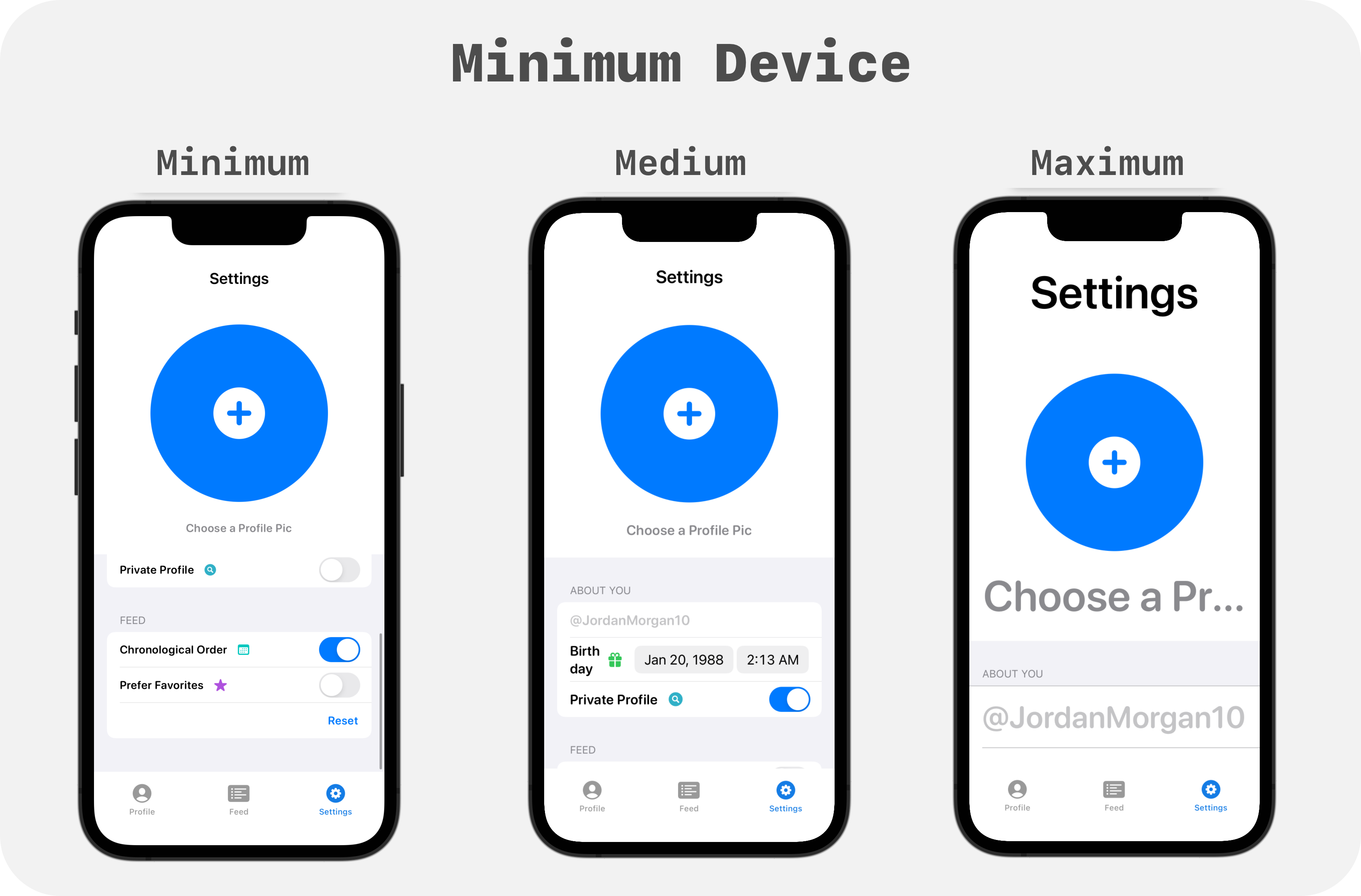
Minimum
The iPhone 13 Mini is my floor, or minimum design spec. Here it is with the three Dynamic Type sizes:
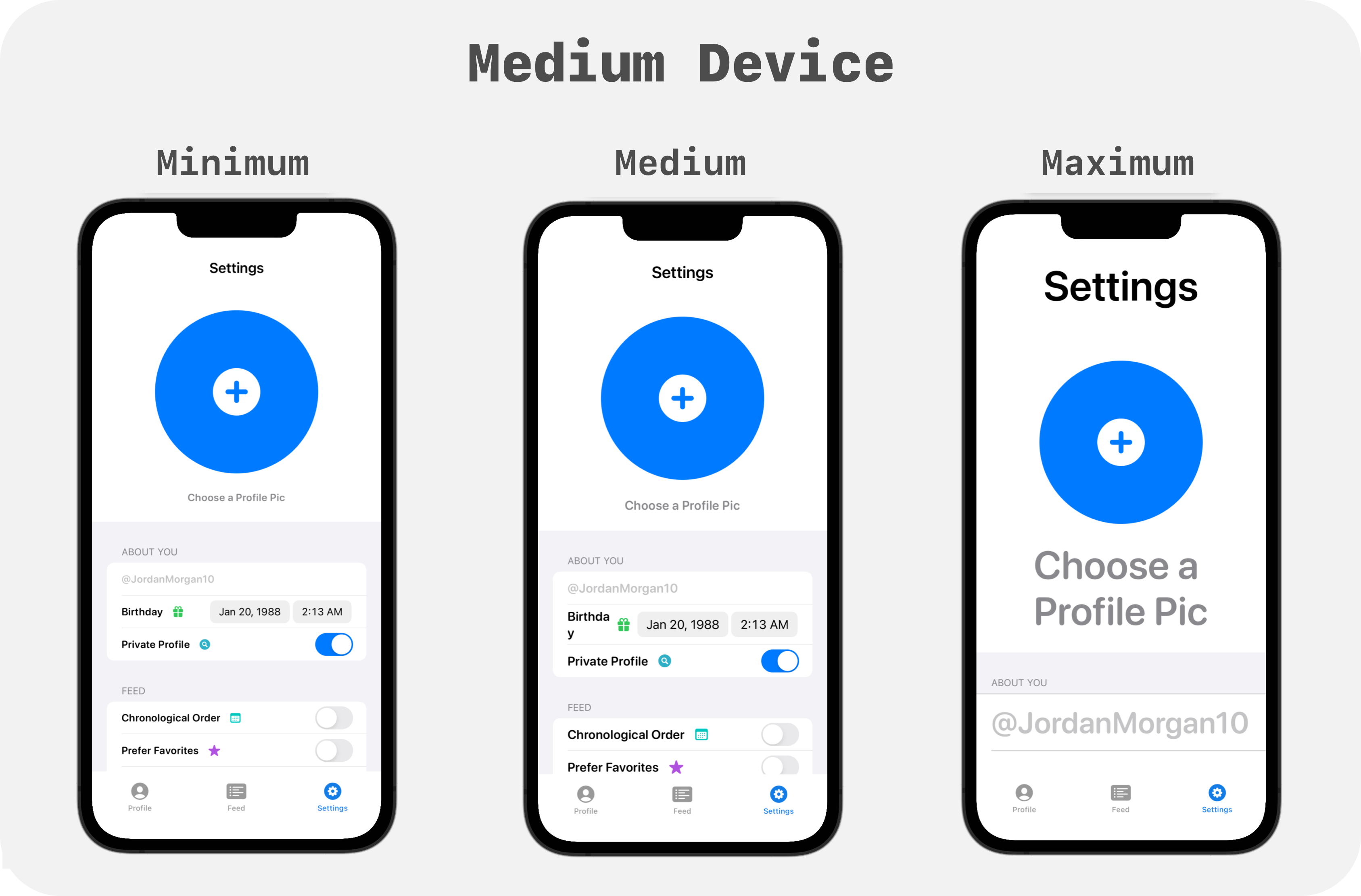
Middle
The latest “base” iPhone is my baseline, or medium design spec. It will be the most commonly used among folks. I optimize for every single spec here (min, medium and max), but if I need to bend somewhere — it’ll be on the minimum or maximum spec. In short, by virtue of this size representing the vast majority of people using the app, I take extra care to make sure it looks impeccable:
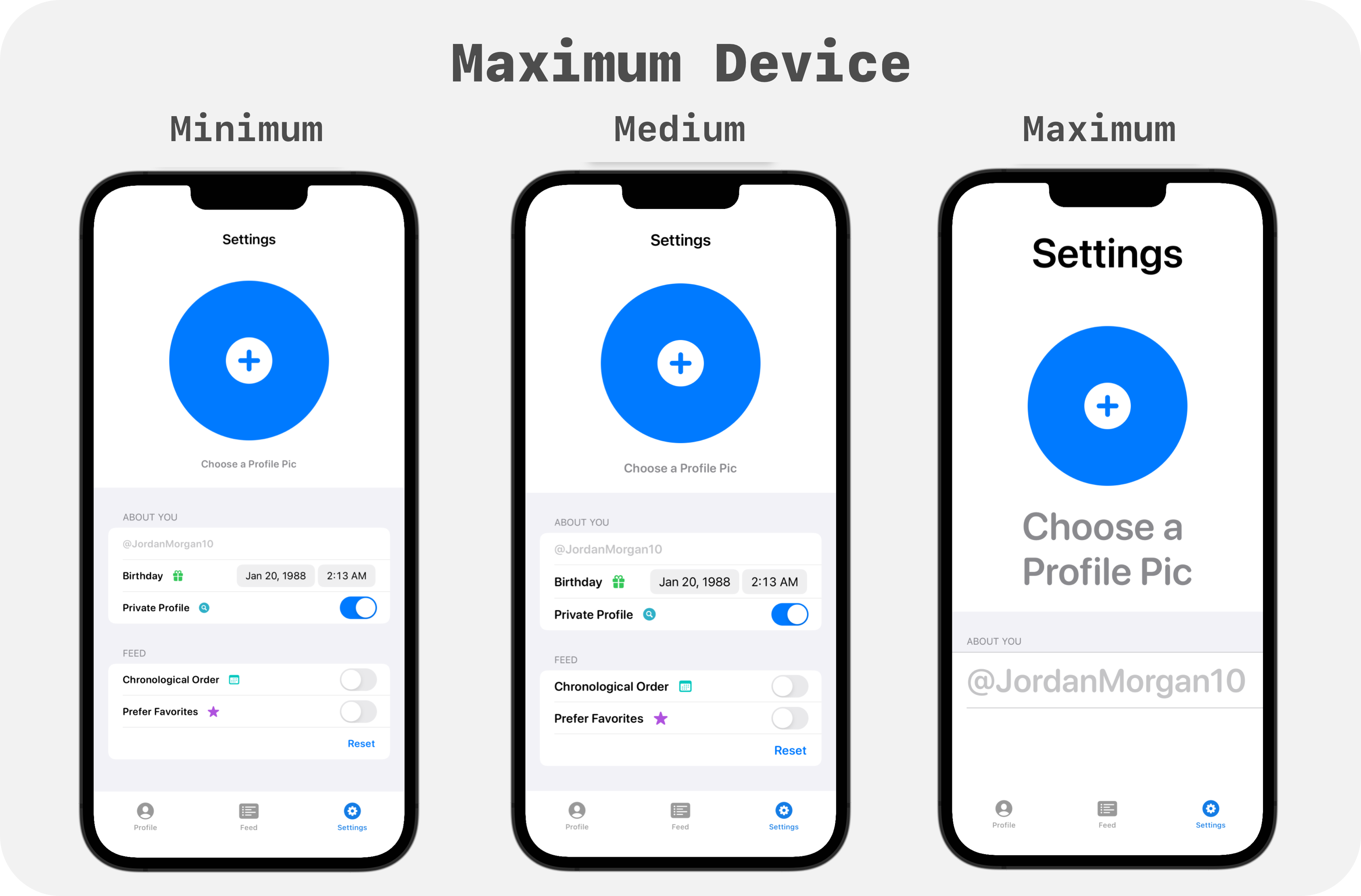
Maximum
Finally, we arrive at the ceiling, or the largest of the three design specs. For me, that’s the iPhone 13 Pro max. Developers and designers alike seem to think you’ll run into the most issues at the minimum spec, but I disagree. I see a lot of the same issues at this spec:
Tiny Tips
So, what can we learn from this current design? Let’s review some typical takeaways. In this piece, my aim isn’t to show you how I’d fix the issues in the design, but to demonstrate how I think about them after using this method:
- Large Screens Don’t Save You: It’s easy to fall into a trap of, ‘There’s a ton of space here, it’ll work’, but that’s not always the case. Look at the maximum Dynamic Type setting on the maximum design spec. Space didn’t save us there. It suffers from many of the same issues the smallest design spec did with the largest Dynamic Type setting.
- Create Adaptable Interfaces: If you’re using UIKit then use AutoLayout, respond to changes in the trait collection or use a view controller lifecycle method, such as
viewWillLayoutSubviews, to course correct your interface. Adaptable interfaces switch stack view axis’ on the fly, or in SwiftUI they use an HStack for this design spec or a VStack for that design spec. - Know When To Flip Things: Here’s a free snippet I have in the Accessibility book from my book series that I use for
UIStackView, please feel free to adapt it to your needs in SwiftUI or UIKit:private func adjustAxisIfNeeded() { let isAccessibilitySize = UIApplication.shared.preferredContentSizeCategory.isAccessibilityCategory if isAccessibilitySize && axis != .vertical { axis = .vertical alignment = .fill } else if axis != .horizontal { axis = .horizontal alignment = .firstBaseline } } - Every View Should Scroll: In the end, Dynamic Type means scrolling is not a thing that might happen, it absolutely will happen. My friends at Lickability just wrote about this.
- Using UIKit? You Can Still Test Quickly: I recently wrote about how to use Xcode Previews for UIKit to make testing things like this faster. Or, you can use Krzysztof Zabłocki’s insanely clever project to use hot reloading.
- Bonus Point for Landscape Testing: Several folks probably use landscape mode in your app if you’ve not restricted it, so be sure to see how things behave there. Yet another reason that every view benefits from scrolling.
Final Thoughts
On the outside, testing seems simple. Write or design a thing. Run it.
But the thing is, with iOS you have to run it a lot of places. With a lot of settings. The deck is stacked against you.
So make it easier on yourself. If you can cover the floor, median and ceiling of your designs, the rest should, as they say, “just work.”
Until next time ✌️