Maybe it’s just me, but it seems like we’re seeing quite a bit more custom controls in iOS apps lately. My theory? It’s a direct result of SwiftUI, wherein its composable nature makes them easier to architect when contrasted to UIKit. Override init(frame:)? Nah, just toss a VStack out there and add what you need.
The barrier to entry is lower, but the risk for tomfoolery has scaled linearly.
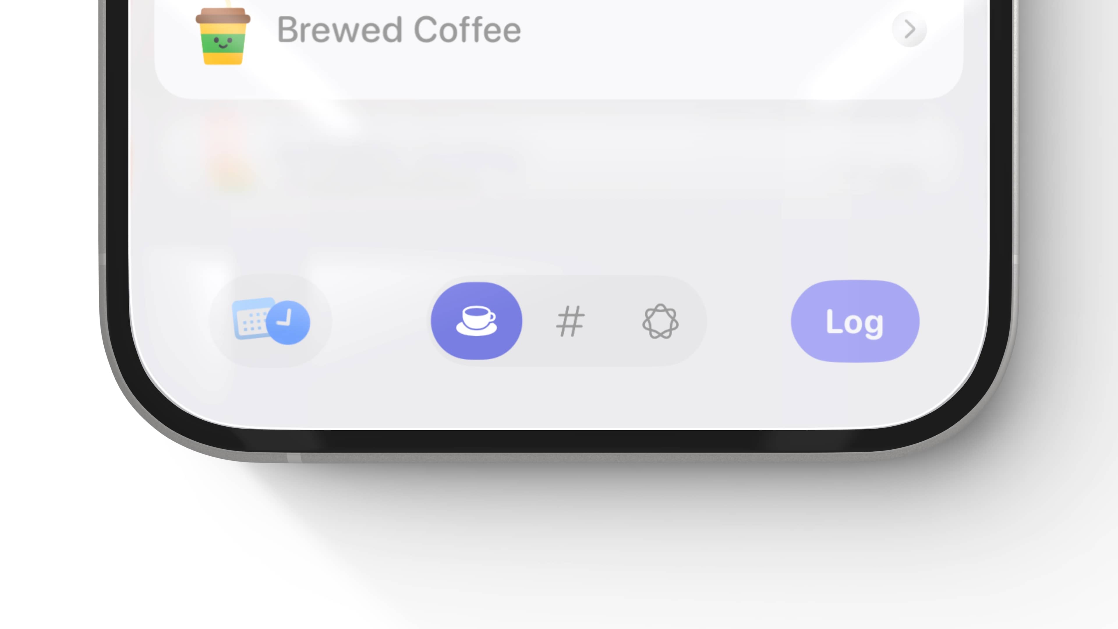
Thankfully, Apple has done a phenomenal job of keeping these controls accessible. Most of it, true to form, “just works” — but some of it doesn’t. So here’s a quick guide to follow, should you consider a custom control. Our subject matter for this post? This little toggle-segment guy found in Alyx:
For custom controls, there are three rules I try to follow. Each custom control should be:
-
Learnable: If something is not obvious to use, people will not use it at all.
-
Memorable: If something has no obvious reason to be used in lieu of the system control, reconsider making it.
-
Accessible: If something can’t be used by everyone, then it probably shouldn’t be shipped to anyone.
So, back to my toggle guy.
Learnable
Is this learnable? I think so, because it passes the visual inspection test. If someone looks at it, they are likely to understand why it’s there and what it might do (regardless as to whether or not they are privy to the tech scene). Here, they are likely to think, “This seems like a toggle.” That’s not by accident, as a Picker with the segmented style is a prevalent SwiftUI control, whose roots go back to UISegmentedControl (a control that’s been around so long iOS wasn’t even called iOS when it first shipped, it was iPhoneOS).
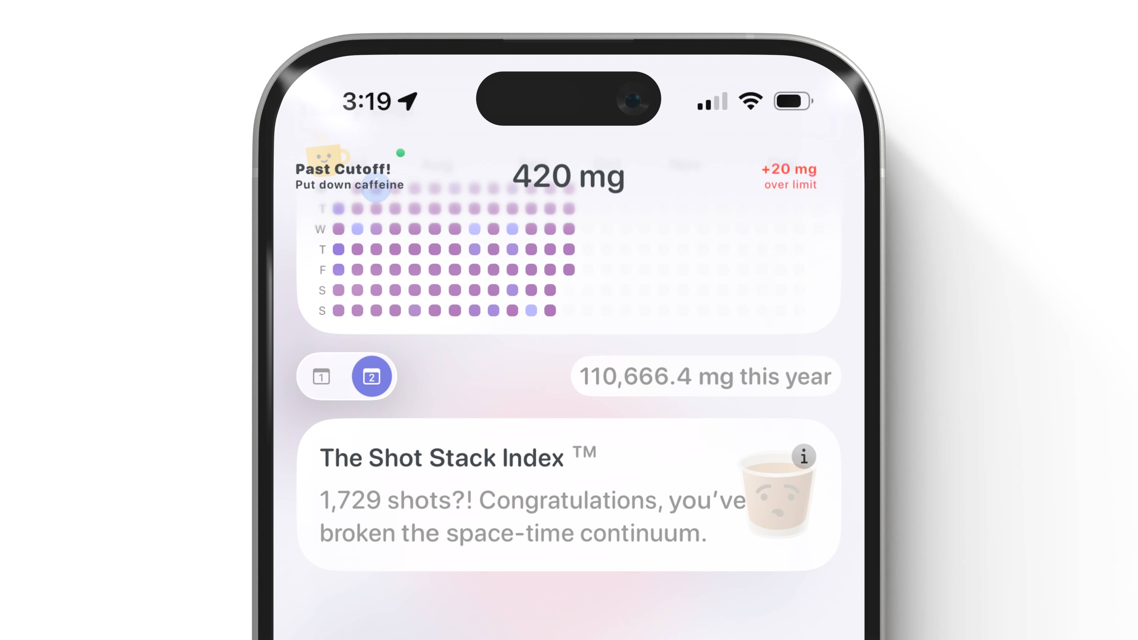
Like other controls, if it works, then it inherently becomes more flexible, too. I have another similar variant of the same control I use to toggle dates, it’s mostly the same but just a smidge tinier:
There is a tolerance scale you have to weigh here, and finding the balance on it doesn’t come naturally to a lot of us. It’s easy to make a custom control because you can, it’s not exactly hard anymore. Always pump the brakes first, and ask yourself if the control will be understood at first glance. If the cognitive load to understand it is high, then the reason to ship it should be low.
Memorable
But (and there’s always a "but", isn’t there?)!
There is, of course, a spectrum here — because part of the joy of custom controls can be discovery. If the intent is to drive home some selective emphasis and joy, I tend to think that’s a completely legitimate reason to make a custom control. We can wax poetic about how boring software is now, but…actually — yeah, let’s keep doing that! Adding a little splash of creativity to your app can be endearing, and it can also make it memorable.
There are different ways to be memorable, though, and many of them have nothing (at least, directly) to do with jolts of pure creativity. For example, when Loren Brichter created the pull to refresh UX, I assume that it wasn’t exactly created to be splashy, nor was it the product of a need to express a creative outlet, it just made more sense than we had been doing. The rest, is of course, cemented in history on your phone right now. We all pull to refresh.
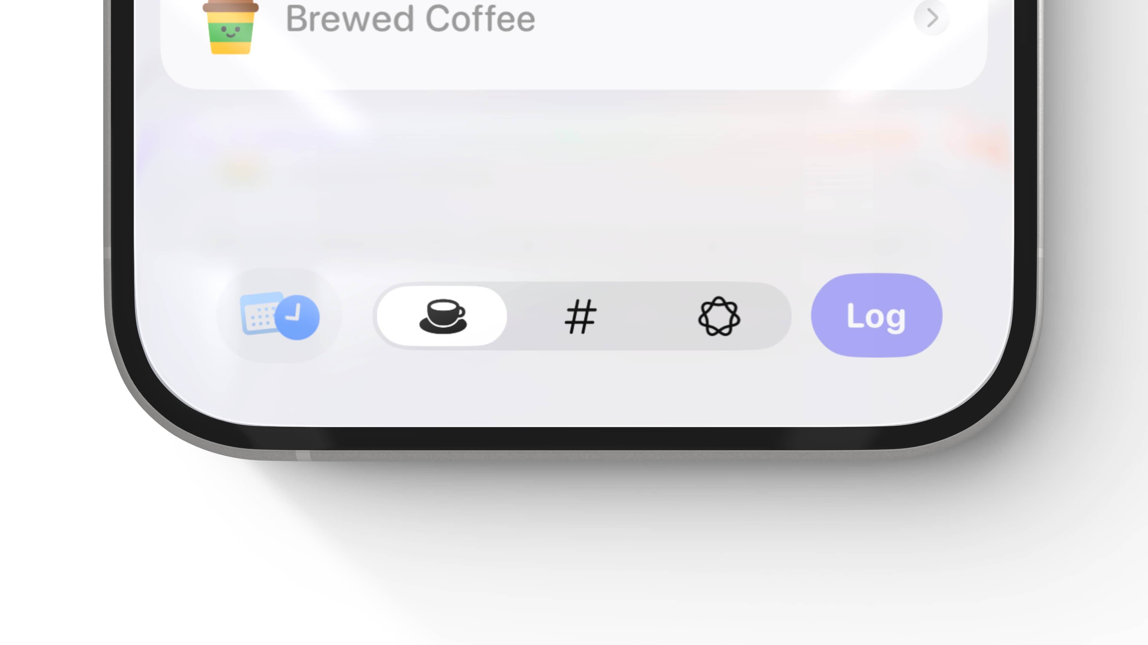
As such, my decision to make the custom toggle in Alyx was a creative one. I wanted to reinforce its branding, the roundy-ness, bouncy and playful tone of the app, that nothing is really that serious here. And, it was just a gut call to assume that this one was better than the stock one for my use case:

Accessible
Of course, if it’s not accessible then you’ll run into a whole host of issues. Empathy is the best teacher, and it wasn’t until I personally met someone who relied on accessibility features on their phone that I truly grasped how critical it is to consider. While you can easily say it’s the right thing to do, I think that’s an obvious argument to make. Of course it is!
Beyond that, custom controls that fully support all accessibility contexts also have an air of craftsmanship to them that not everyone is willing to achieve. And, it’s so easy to do that now! Apple has a killer API for custom controls and accessibility, .accessibilityRepresentation. This lets you vend an entirely different control to the accessibility engine in place of the one that you’ve made.
Why is that critical? Because you can pass off Apple’s controls! And guess what? They’ve thought about more accessibility edge cases than you or I have. So, here, that could look something like this:
HStack {
    theControl
        .accessibilityRepresentation {
            Picker("", selection: $inputMode) {
                ForEach(PresentationInput.allCases) { mode in
                    Button {
                        update(to: mode)
                    } label: {
                        Image(systemName: mode.glyph)
                    }
                }
            }
            .pickerStyle(.segmented)
    }
}
Now, the accessibility engine will see Apple’s far superior accessibility implementation. When Apple shipped this change, it became immediately obvious that this was the best way to handle similar situations — I couldn’t believe A) I had never thought of it, and B) it didn’t ship with SwiftUI 1.0. It’s a literal cheat code for a good accessibility outcome.
Even though I just mentioned there is a little hint of craftsmenship to fantastic accessibility support in custom controls, on second thought — the APIs, SwiftUI and UIKit have become so accessible by default that it’s almost harder to make something not accessible. That’s a good place to be.
So that’s my thought process. Learnable, memorable and accessible. If your custom control passes that smell test, then you’re probably heading down a good path.
Until next time ✌️