Did you know that the version of Spend Stack I released a few short months ago is actually… not the first version?
It’s true that I did take many years to design and develop it, and it’s also true that was due to a variety of reasons (having three kids, married, job - life stuff). But another important reason was that I was teaching myself design. If I had to guess, that’s where more than half of those years went.
Why?
Well, because this thing is how the first version of Spend Stack looked:
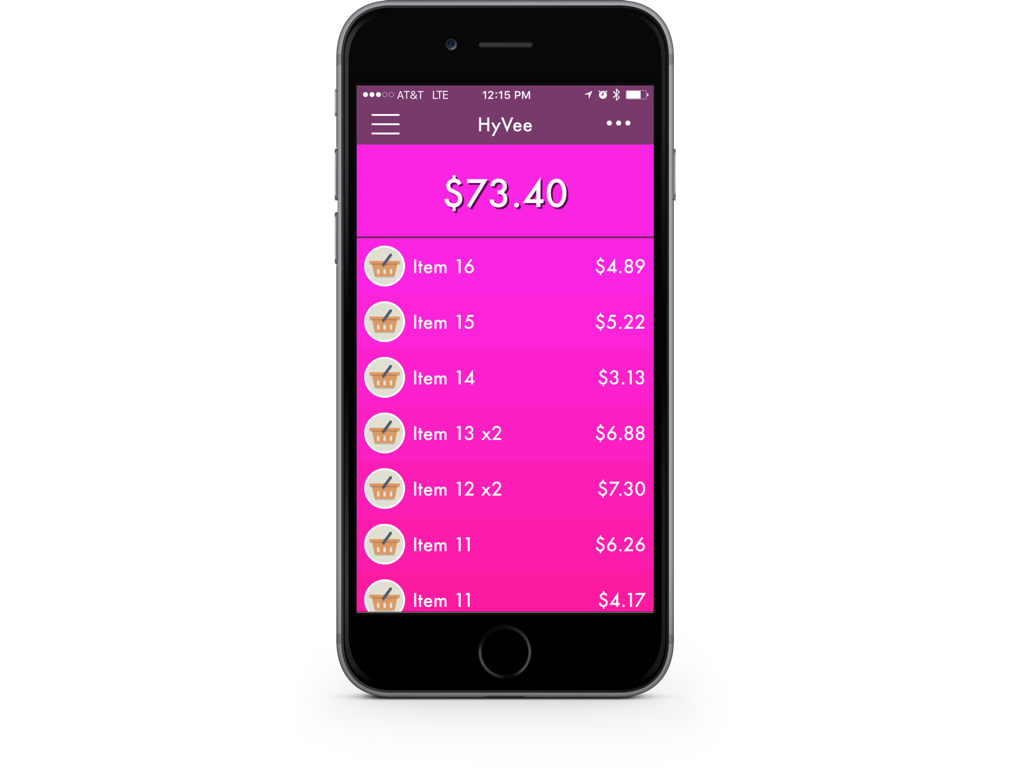
For real - I’m dead serious! I even had a good friend whip up a promo trailer for it:
This might strike you as quite surprising if you’ve ever used or have seen Spend Stack, because this is how it looks today:
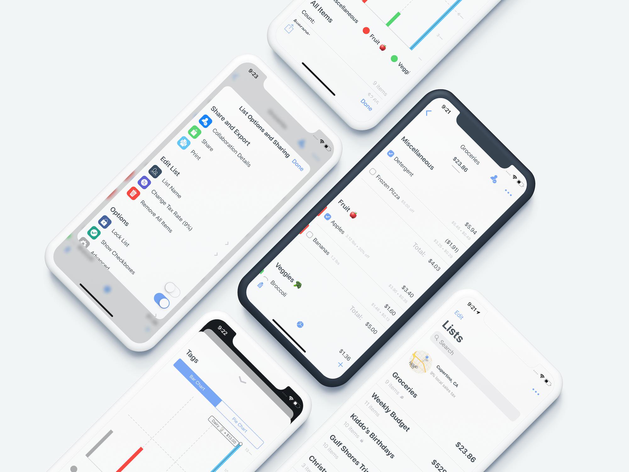
Given that, the obvious question becomes:
How did I go from something that was objectively bad design, to making the design become a strength of the app?
Today, I’m going to lay out eight core lessons I learned over the years which helped me appreciate design. They each will help answer the question of “How can indie devs learn about design?” While I still wouldn’t consider myself a designer, I’d submit to you that it’s nearly undeniable how much better Spend Stack looks, works and functions today in comparison to what it did five years ago.
let concatenatedThoughts = """
A small sidebar before we continue - what follows below lays squarely in the "this is my opinion" category. Simply put, these are the things that helped me out. Design has objective truths, but can also have many subjective opinions. My goal here is to shed light on some design practices for those indie devs out there who might be stuck with it as I was. Let me tell you, I have not figured out design. I still see a million things wrong in Spend Stack today, but I'm getting there.
"""
That said, without further ado here are the lessons I’ve learned, and the order in which I learned them:
- 1. Something You Can’t Ignore
- 2. Start with a Mission Statement
- 3. Who’s It For?
- 4. Never Start with Technology
- 5. Find North Star Apps
- 6. Always Ask Yourself
- 7. How Does Apple Do This?
- 8. Design Centric Materials
Lesson 1: Something You Can’t Ignore
The first thing I realized about Spend Stack of yore was that the idea of the app was validated, but the design made your eyes bleed. As such, the app’s idea or functionality (which are intrinsically tied to its design) didn’t matter much.
let concatenatedThoughts = """
In this lesson, when I say "design" I'm more pertaining to the "smell test"/judge-a-book-by-its-cover bits of design. Design is a function of many things - how it works, what it does and how it does it, not just how it looks. But in this lesson, it's all about the looks.
"""
It could solve a problem, it could save you money. Nay, it could just print money. It could cure diseases!
But if the design sucks, nobody will care. Because this is the App Store, and not really a B.2.B. market where a terminal U.I. can still win contracts. Realizing this, I had a little saying that was in my Notion workspace for all things Spend Stack, and it simply said the following:
“Design isn’t everything, but it is the only thing that matters.”
And you can debate it however you want.
Functionality and user experience are paramount. But to me, those are a byproduct of good design. Marketing, validating your idea, having an incredible app that does one thing well - all of those things matter. But if the app doesn’t look and feel right, people won’t give it a chance.
Of course, nothing I am saying here is gospel. There are exceptions to every rule. But playing the averages, the numbers say that an ugly app that does a thing well will probably sell far less than a beautiful app that’s not really giving you much.
You have to take design seriously, you have to learn things about it and you have to be critical of your own apps and figure out why or why not its design works.
To make this abstract idea and make it more concrete, consider this view in the first Spend Stack that was used to create a list:
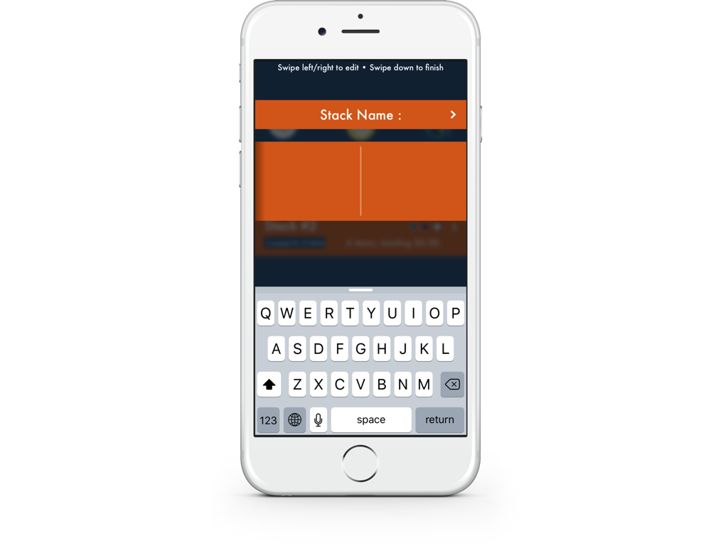
Why do I consider it poor design? Here are a few reasons:
1) The hints at the top are already an issue. As they say, user interfaces are like a joke in that if you have to explain them, they aren’t funny (i.e. functional).
2) Those hints are there because to create the new list, you had to swipe down. The gesture was hidden.
3) Because of that, this view hides its main functionality - which is creating a new list. A button should have been used here.
4) The colors.
5) To input data for each option (such as the name, tax rate and more) you had to swipe within the middle box area. A list would easily convey the view’s affordances.
6) I firmly believe being a best in class app is part of design on iOS. Given that, this view ignores accessibility fonts, dark mode and much more.
To contrast that view, here is what it looks like today:
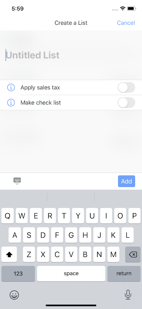
Much better. The process of redesigning Spend Stack made me appreciate how important design is. You’ve no other recourse but to consider it as much as we do software architecture or whether to use SwiftUI versus UIKit. I realized that design is something you can’t ignore. You have to think of it constantly, and users will know it when they see it.
So as you go about your indie dev days, remember:
Lesson one: Design is something you can’t ignore.
Lesson 2: Start with a Mission Statement
Much like a ship wouldn’t leave port without a destination in mind, so too should indie developers define what their app will do before putting code to compiler.
And this is hard to grasp for a lot of us because all apps technically start with an idea. But an idea is dangerous! Why? Because an idea is an amorphous blob of several themes, problems, aspirations, and jobs - almost all of which should be shed in the beginning phases of your app’s inception. Conversely, a mission statement proudly proclaims in one sentence what your app will do and what problem it solves.
For example, let’s say you had an idea to create a podcast player. Most of us will crack open Xcode and rock and roll. Months later, we might release something that isn’t differentiated in any meaningful way, does the same thing as most other podcast players and leaves no lasting reason for why anyone should let go of other established players such as Overcast, Castro or Apple’s built-in solution.
To help mitigate such an outcome - I’ve found that it often helps to bottle that excitement stemming from your idea up, and hone it down into something tangible and zeroed in. Ask yourself a few questions to develop your idea into a mission statement. Following our podcasting example:
- Why do I want to make a podcast player?
- Can mine offer things that other podcast players do not? Even if it’s a better, or different, design that people would want?
- If the answer is “not much”, what shortcomings do the current solutions have that I could make up for?
- And if I can do either of these things, is it worth it to me to put the time in to see it through?
- If it is, will it be a pet project or something I want to sell?
- Given this information - can I make a mission statement for this app?
A mission statement is powerful - it could literally save (or make you!) thousands of dollars while preventing wasted hours along with heartache and disappointment. If you’ve got a mission statement, you know what to make, what to cut and where to go next. Plus, users will have a much better idea of what they are buying - because they’ll simply know what it is and the problem it will solve.
I think Dale Carnegie put it best:
“And if salespeople can show us how their services or merchandise will help us solve our problems, they won’t need to sell us. We’ll buy. And customers like to feel that they are buying—not being sold.”
On a marketing document I often visit, I have my mission statement front and center to remind me to consider all of my upcoming decisions against it:
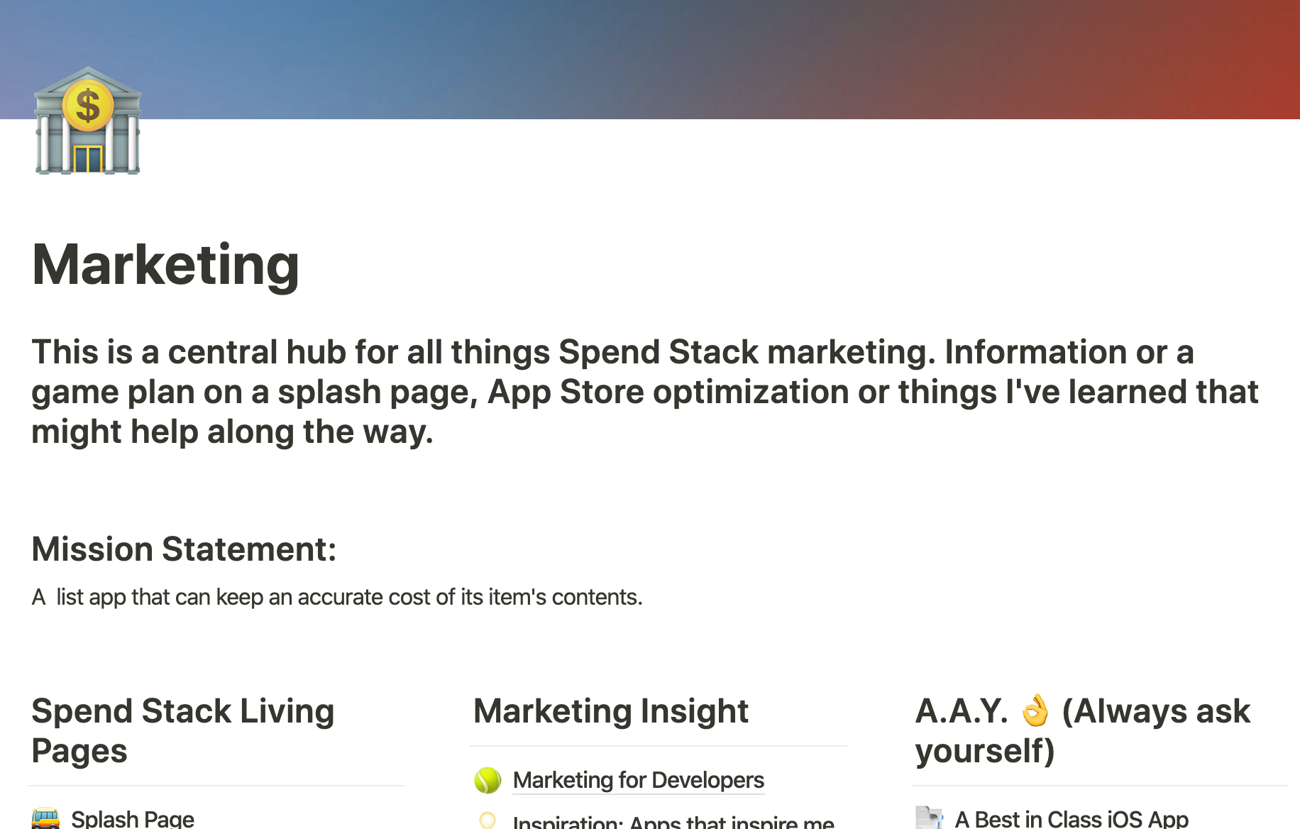
It’s helped me cut features, know when to add features and so much more. You simply can’t leave home without it. Tonight, as you map out your next app or consider adding to your current one - remember:
Lesson two: Well designed apps stem from a focused mission statement.
Lesson 3: Who’s It For?
If you’ve got a mission statement, you can hunt down a persona for the app. Personas are awesome. Straight up. I’ll be the first to admit I found them a bit cheesy, only suitable for corporate board room exercises. But I just didn’t see their value, and now that I have it’s hard to think about skipping out on them.
Developing a persona for your app is simply the process of mapping who your user might be. And if you know who your user might be, you can surmise all sorts of important things:
1) What do they value?
2) Where do they hang out, and what do they do?
3) Most importantly, does my mission statement solve problems that they currently have?
If you’ve got a target customer with a problem you can solve, that’s a huge first step. Considering it, you can consider if they might pay for your solution.
let concatenatedThoughts = """
This lesson comes with an asterisk. Maybe you don't care about making money on your app. If that's the case, skip on to the next lesson. But even if you don't, it's still important to figure out who you're making the app for - if only for people like yourself.
"""
This phase is especially difficult because iOS apps tend to have broad appeal. Given that, they often solve “vitamin” problems. In his book Marketing for Developers Justin Jackson laid out a way to consider whether or not your target customer might be willing to buy your product. He did so with a pain tolerance concept, and I don’t remember it word for word but the gist of it really resonated with me.
Is the problem you’re solving a major, game-changing issue your target customers are facing? It’s a life or death problem - they’ll be willing to pay handsomely for something to take this problem off of their hands. Or, maybe it’s a bone-breaking problem. It hurts pretty bad, but they’ve made due. Maybe there is a temporary stint they’ve applied to the problem, so they want it addressed and would likely pay for it to go away.
The idea keeps going down until you reach a “vitamin” level problem. These are problems that are minor nuisances, and if a person simply takes their vitamins they go away. They will likely only pay for a solution to the problem if it really speaks to them, or it solves the issue extremely well and for a small price.
In addition to knowing if your target customer might pay for it, knowing who they are defines a lot of other things, too. Every app has a voice, and your target customer helps define it. If a networking error occurs, you’ll know if they would enjoy copy in the error messaging U.I. that’s funny, or if they’d prefer a more formal tone. This concept flows throughout each part of your design.
Before you crack open Sketch or tab over to Figma, remember:
Lesson three: To design well, you’ve got to have an idea of who you’re designing for.
Lesson 4: Never Start with Technology
And now we arrive at my most painful tendency as an indie dev. I’m talking, of course, about using a particular technology because it’s either new, fun or we just want to learn it.
In the first version of Spend Stack, I had swipe to delete:

And do you know why?
Because six or seven years ago (before this UX was common and built right into iOS) I found a Github project that did it. And I thought it was cool. So, I jammed it into my app.
I didn’t ask any other questions or stop to think about why I was doing what I was doing. That’s a sign-in of itself. You can see where I’m going with this, but I’ve made this mistake so many times and lost so many hours because of it - I might as well be writing a diary entry right now. And it would say only this:
“Define the problems first, and work your way back with the technology that solves them. Don’t start with the technology, and look for problems to solve.”
The famous Steve Job rebuttle to some public criticism demonstrated this point succinctly. In it, he said:
“One of the things I’ve always found is that you’ve got to start with the customer experience and work backward to the technology, you can’t start with the technology and figure out where you’re going to try and sell it.”
It’s so hard to do, too! As developers, we are naturally drawn to new APIs and frameworks. In fact, this very reason is why W.W.D.C. is my favorite time of year. Mountains of new API! I’d even argue that it’s a very healthy sign that you love doing what you do - learning new things and picking up new ways to solve architectural issues gives us a buzz. But don’t let it cloud the design part of your brain.
To everyone else it’s obvious, for developers it’s difficult - but never start with the technology, start with what the user needs and work your way back towards the tech. Because if you don’t, you’ll end up with little edges of your app that don’t fit a central theme or support the mission statement. You’ll have things that feel out of place or the user experience may feel a bit scattered.
Next time you feel the urge to add one more line to your podfile, remember:
Lesson four: Starting with technologies and looking for problems to solve in your app could hinder its design.
Lesson 5: Find North Star Apps
You’ve likely heard the phrase, “Good artists copy, great artists steal” and it holds true in design. Much like I alluded to in my post about releasing your indie app, the concept of finding people you aspire to be like flows directly down into design and iOS apps.
Find the apps that you love using, and then write down why you love them. It sounds obvious, but I hadn’t done this in the past. I had apps I loved using, but actually putting pen to paper and writing down at least three reasons why uncovered a lot of helpful direction I could use for Spend Stack.
Beyond that - find the apps that Apple has given its seal of approval to. I have each Apple Design Award Winner bookmarked in Safari, and every now and then I poke around their apps just to see how they (deservedly so) got that ultimate award.
Remember, it’s beyond just the looks here. A lot of apps may look good, but even less feel good. Further still, not many look and feel good. Here are some starter questions you might ask yourself about apps you enjoy:
1) Why does this app feel good to use?
2) If I wrote this app’s mission statement, what would it be and why does the app support it?
3) What have other people, whose opinion I respect, said about the app and why they do or do not like it?
For another example directly related to Spend Stack, I made it a point to often look at Federico Viticci’s feedback on iPad apps he enjoys. Since he knows the marketplace very well, and is a power user of the platform - he’s in a good position to uncover little things that apps do well to separate them from the rest of the pack.
Recently, he made mention of how he could navigate an iPad app (I believe it was Things 3 maybe?) almost entirely from the keyboard, which inspired me to make that a bar I will eventually hit for Spend Stack. It sounds like a fairly “well yeah!” observation, but with a million things happening while developing Spend Stack, I sure didn’t think of it.
Next time you’re short on inspiration, remember:
Lesson five: Reference apps that you enjoy using and figure out why you, and others, enjoy using them.
Lesson 6: Always Ask Yourself
Much like having iOS apps that you aspire to be like, it also helps to have certain rules, or an ethos, to ascribe by as you develop indie apps. A north star framework, if you will. I’ve found that I often forget the simple things, and so I wrote them down and put them in a place where I’m sure to see them often.
I call these little things “always ask yourself” tips. Almost all of the ones I have written down have to do with design. To me, design is like math. It doesn’t come naturally to me, but I can do it - I just really need to focus a bit harder on it. So plopped right in my app delegate file are these little tips that help me frame my mind for the work I’m about to do:

It’s a little silly, and certainly not for everyone - but they’ve done wonders for me. It simply reminds me to focus on design, and before I chase a random thread that might lead down some rabbit hole, I should stop and consider if what I’m doing is worth it. Does X or Y help promote a cohesive design, or am I straying off the path a little?
Expanding on this idea a little more, I also have fully formed documents that hold thoughts, ideas or things that I want my apps to be known for. In fact, the one I have in my Notion workspace is what my best in class iOS app post came from:

This idea is the same reason college stadiums have inspirational quotes sitting right outside of locker rooms, or offices have pictures with motivational quotes hanging on the walls. It’s because they offer a simple proposition: reminding us what we’re about, what we want to do or where we want to go.
As you go about writing your Swift or Objective-C today, remember:
Lesson six: Always ask yourself if the work you are doing is enforcing a solid design and direction that’s been laid down for your app.
Lesson 7: How Does Apple Do This?
This is my secret weapon hiding in plain sight. Whether you fall into the “Apple is amazing at design on iOS” or the “They lost their way on iOS 7” - I only know one thing: they are the ones who hand out A.D.A.’s, who have more context or data than anyone else, spend all day on the platform and are the subject matter experts.
So look to their work when you are stuck, need inspiration or aren’t quite sure what to do. I’ve got two tips in this area:
Tip 1 - Have their apps on your home screen.
Tip 2 - Recreate scenarios you’re stuck on in their apps.
Tip 1 is fairly self-explanatory, but I’d love to toss out an example of where tip 2 came into mind for Spend Stack. As I was developing its sharing functionality, I was struggling with coming up with copy for this scenario:
- A user has shared a list of theirs with someone.
- The owner deletes this list, but doing so will also delete it from the other share participant’s devices.
- As such - how do I alert them of this?
As I want back and forth, I realized that Notes on iOS could also have this same scenario. So, I grabbed a test device and my iPad and recreated it. Their copy had perfect messaging, and so I ended up with much of the same thing for Spend Stack. The only change I made was tweaking “ok” to a destructive “delete” (per Apple’s advice, I may add):
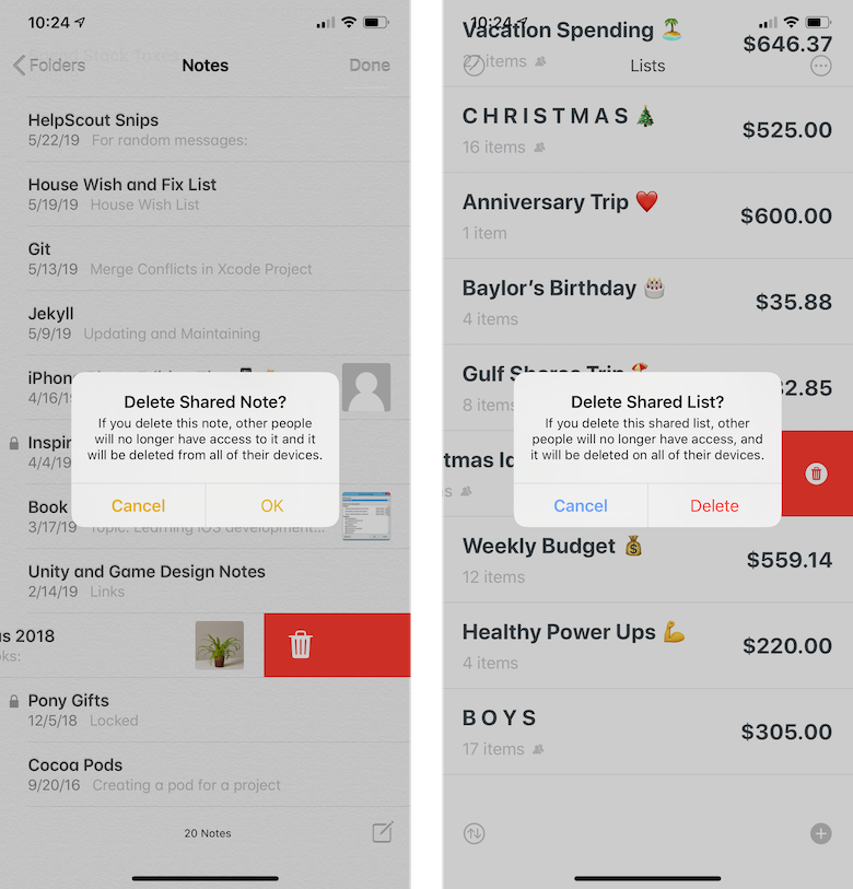
Borrowing liberally from Apple is a good thing, and I’ll tell you why; Aside from being experts of the platform, the biggest advantage is that users are already comfortable with the flows, copy and designs that they’ve established. As such, if a user has used Notes before, shared a note and then later deleted it - that user will know what to expect when they do the same thing in Spend Stack. It won’t make them think.
As you question some assumptions today and aren’t quite sure what to do, remember:
Lesson seven: See how Apple has solved similar problems, designs or copy within their apps and consider using them yourself.
Lesson 8: Design Centric Materials
A common theme has hopefully emerged from the previous seven lessons, which is that these things are much less about how to use colors correctly, when to consider a certain font or what margin to use - it’s about cultivating a design mindset. By far and away, this has helped me the most.
But, at the end of the day, you most certainly do need to learn about the more concrete truths and practices of design. For that purpose, I’ve found a few things that I reference quite often to develop those skills.
First, the most important one. Consider it your design bible for Apple. I’m talking, of course, about the human interface guidelines. If you haven’t done so yet, stop everything now and read the H.I.G. from beginning to end. Some of it, I admit, can be dry by nature - but the upside is too important to ignore.
Following the H.I.G. simply means you’ll know what a great app looks and feels like, the technology available to you to make them possible and when to follow their advice to the letter and when to add a little personal spin on things. It’s simply the first and most important step to improving your iOS design skills
Why does Spend Stack’s onboarding experience offer three main advantages to the app, is quick to dismiss and doesn’t ask for inessential setup or configuration data upfront? Because I took cues from the H.I.G. on the matter:

Further, here are the design resources I often visit to learn more:
These may or may not help you, but find the resources that do and study them often. So before you wireframe your next view, remember:
Lesson eight: Keep design resources close by to learn from, and keep the H.I.G. at the top of the pile.
Recap or TL;DR
Here’s each lesson mapped out for your reference:
Lesson one: Design is something you can’t ignore.
Lesson two: Well designed apps stem from a focused mission statement.
Lesson three: To design well, you’ve got to have an idea of who you’re designing for.
Lesson four: Starting with technologies and looking for problems to solve in your app could hinder its design.
Lesson five: Reference apps that you enjoy using and figure out why you, and others, enjoy using them.
Lesson six: Always ask yourself if the work you are doing is enforcing a solid design and direction that’s been laid down for your app.
Lesson seven: See how Apple has solved similar problems, designs or copy within their apps and consider using them yourself.
Lesson eight: Keep design resources close by to learn from, and keep the H.I.G. at the top of the pile.
Final Thoughts
As indie developers, we’re forced to wear many hats. And the one of design might be the most important of them all. But years ago, I foolishly resigned to the notion that I had boxed myself into being purely a developer, a code junkie - someone who could implement the good looking thing, but who would never design it.
Being at the other end of the tunnel now, I think Spend Stack is a living testament that anyone can learn design to some degree. Sure, many are just “born with it”, institutions can teach it and millions of other talented people have their careers built off of mastering it - but what about us? The common indie dev who learned all about retain cycles and pointers instead of color theory and typography? Can we?
The answer, is of course, yes.
Until next time ✌️.
