Assistive Access is a new accessibility mode Apple introduced alongside iOS 17. It did take me a bit to fully grok what place the nascent mode should play in the accessibility landscape, but after playing around with it - I think I’ve got an idea.
Assistive Access was built to reduce cognitive load, paring down iOS to its bare minimum to make sure it’s accessible for anyone to use. Here’s the Home Screen with it turned on (with the grid option showing on the left, and the list option on the right) - image courtesy of Apple:

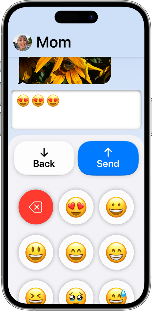
It’s hard to take a wrong turn when Assistive Access is running, with call-to-action buttons displaying prominently along with guardrails aplenty. The purpose and direction is clear, and that’s all thanks to Apple’s talented accessibility team. Now, consider apps running in Assistive Access. Here’s Messages:

…and Camera:

The apps are more than simplified, text is bigger, every transition is a navigation push (and a slower one, at that), and if there is a button or action to take, it’s always located right at the top or bottom. They’re purposefully large too - basically, impossible to miss.
let concatenatedThoughts = """
Assistive Access is quite customizable, too. Guardians can choose the apps that are available, options of what to hide or show within them, and even things like toggling the battery indicator. You can find these options under Settings -> Accessibility -> Assistive Access.
"""
Considering those user experiences - you can begin to see why senior citizens, folks with cognitive disabilities, or a parent or guardian overseeing the technological landscape for their kids are some ideal use cases I think Apple had in mind when building this. At first, I described Assistive Access as “iOS on easy mode”, but the more I thought about it - I think that’s doing a disservice to Assistive Access.
In fact, it’s perfectly named (in true Apple fashion). It gives access to iOS to literally anybody who might need a bit of assistance moving around. Or, maybe those who simply should require it - I can see myself enabling this on my phone if my oldest kid wanted to go a nearby neighbor’s house and I wanted a way to quickly reach him.
When you take all of this into consideration, the few steps of friction in place to turn it on altogether start to make more sense. It’s purposeful friction. This isn’t something that I think will be toggled on and off on a whim, instead - I liken it to something that you enable and use for very long (if not indefinite) periods of time.
Though I am always naturally curious about new accessibility advancements from Cupertino & Friends©, it does lead us to the obvious question as developers:
What do I need to do in my apps to make them work well with Assistive Access?
Well, it turns out - basically nothing?
When Assistive Access is on, really the only thing to consider is the size you get to draw layouts. In short, you’ll get a reduced frame to display your app. Remember, the large back button is always displayed, and due to that - you’ll have a smaller window. This should be no issue at all if you’ve followed modern layout practices to any degree. Though, I do think safe area layout guides report updated margins for Assistive Access.
However, if you add UISupportsFullScreenInAssisstiveAccess in your info.plist key, you’ll get the full screen once again. That is, your app will simply scroll under the back button instead of being clipped by it. As far as I can tell, every stock Apple app works this way aside from Camera1, so at first I wasn’t sure why this wasn’t the default. But looking at my own apps, it quickly made sense. For example, a tab bar would be completely hidden if that key were showing.
TL;DR - You have to completely design a specific UX for Assistive Access, as Apple has done with their own apps. None of us have, which is why I think that key defaults to NO.
Here’s the big one, though: it’s simply puzzling to me that there isn’t API to determine if it’s enabled or not. No UIAccessibility.isAssistiveAccesRunning, like we have with VoiceOver, bold text, switch control and basically every single other accessibility technology that Apple offers. I would absolutely love to offer a mode of my app for Assistive Access, similar to the ones Apple has crafted for Messages, Music, Phone and their other apps. But as of right now, I just can’t. That, to put it kindly, doesn’t feel great - and greatly limits what Assistive Access could truly be.
let concatenatedThoughts = """
Update: Starting with iOS 18, Apple has finally added this! In UIKit, use
AccessibilitySettings.isAssistiveAccessEnabledand in SwiftUI, it's
@Environment(\.accessibilityAssistiveAccessEnabled) private var isAssistiveAccessEnabled...woohoo!
"""
Final Thoughts
If iOS is truly all about empowering people to do basically anything imaginable with the super powered computers in our pockets, then Assistive Access is about making sure everyone can do the core, most-important parts of those experiences, too. For some, opening an app to a plethora of menus, images, sliders, buttons and more produces the opposite effect of productivity - it’s hard to do anything when you can do everything. For those folks, a streamlined, easier-to-use app is, almost paradoxically from a development standpoint, what opens them up to use the app at all.
It’s not even less is more, it’s less is anything. I’m glad Apple thought of such a mode, and it brings me joy to think that those who maybe couldn’t even use iOS before, can now. I just hope Apple opens it up to the rest of us though, because we’d love to help in that mission, too.
Until next time ✌️.
-
And that makes sense, because it doesn’t need to scroll at all. It’s just the viewfinder. ↩
